Navigation Through the Eyes of the User
As part of the CDC’s effort to modernize its digital presence, a core challenge was rethinking how users accessed critical health information across a vast ecosystem of content. Through extensive research, usability testing, and behavior analysis, I identified several friction points that were preventing users from finding what they needed—and, equally important, overlooking content that was vital to their health and safety.
Key findings revealed that users were struggling to locate high-value content, such as CDC guidance documents, data dashboards, and downloadable PDFs. Many of these resources were either buried under unclear navigation layers or labeled in ways that didn’t resonate with real-world user intent. The legacy menu structure also lacked accessibility compliance, making it difficult to navigate for users with disabilities.
These insights directly shaped my strategy to reimagine the CDC’s navigation model through a user-first, accessibility-driven lens.
Key Solutions Implemented:
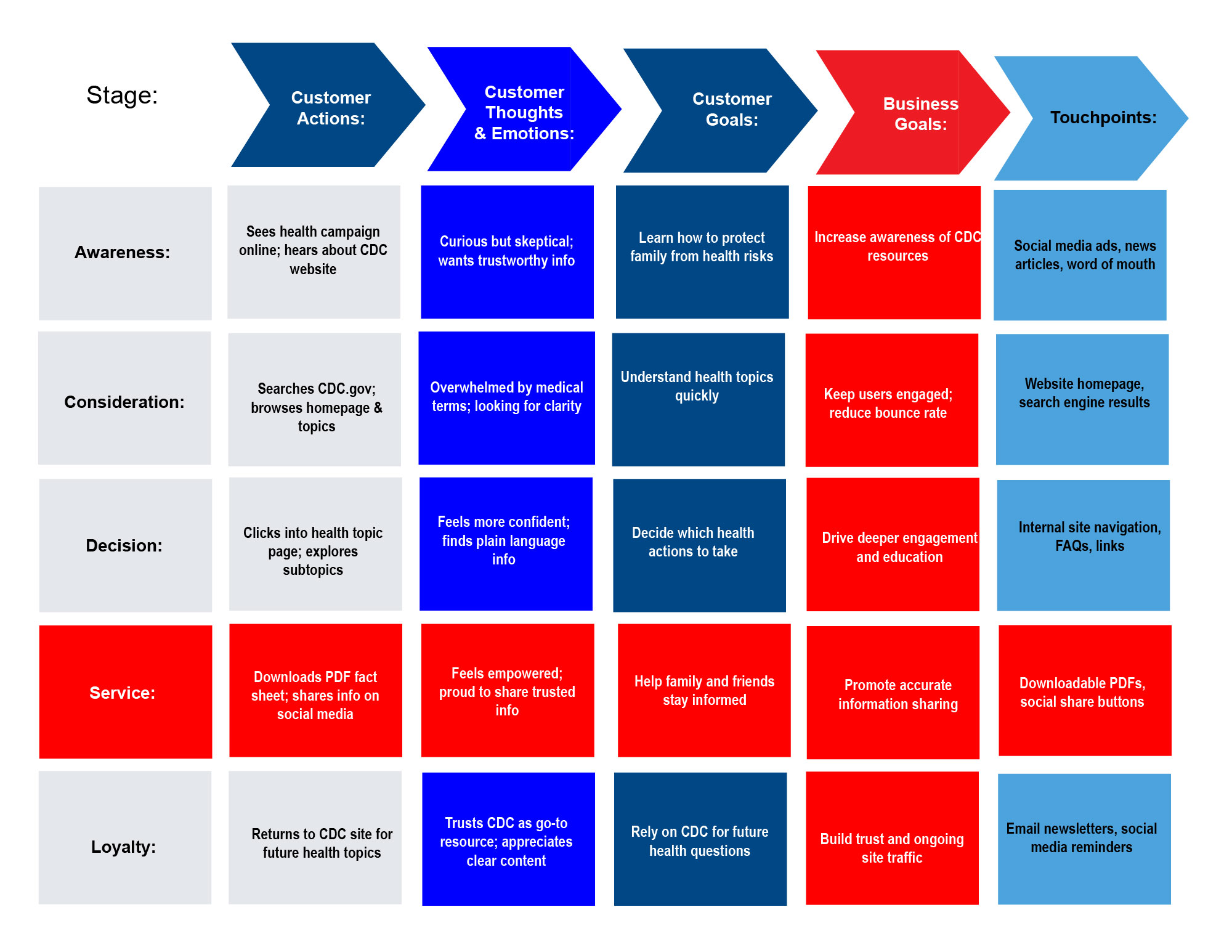
- Flowchart & Journey Mapping: Created detailed flowcharts and user journey maps to visualize how different audiences—general public, healthcare professionals, researchers—approached the site. This helped guide the structure of navigation and content placement.
- Accessible, Future-Forward Menu System: Designed and implemented a fully 508-compliant, streamlined mega menu that was both keyboard-navigable and screen-reader friendly. Categories were labeled with plain-language terminology based on user research, improving clarity and comprehension.
- Prioritization of High-Value Content: Ensured that critical links, reports, and documents were surfaced through contextual CTAs and prominent homepage placements. Key health alerts and frequently accessed tools were given visual prominence and linked from multiple entry points.
- Simplified Content Discovery: Introduced a clear, topic-based hierarchy and added filters and contextual navigation panels to reduce click paths and eliminate dead ends. Content was grouped by user needs and intent rather than internal taxonomy.
- Improved Navigation Flow: Implemented same-window navigation where appropriate to maintain continuity and make browser navigation (i.e., back button) more intuitive for users.
- Breadcrumbs & Wayfinding Enhancements: Developed a breadcrumb system to provide users with clear orientation and allow for fast navigation back to previous sections, especially within dense content areas.


