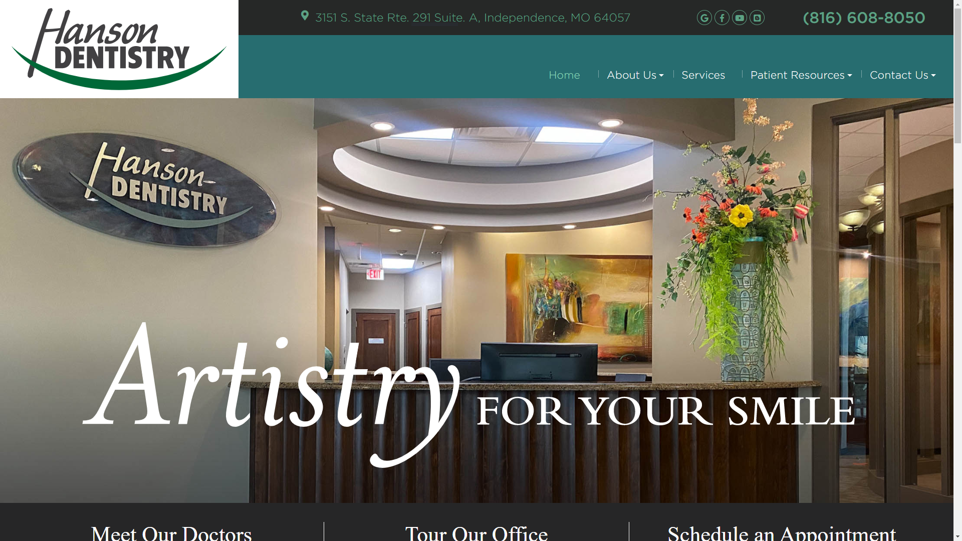
Handson Dentistry Website screenshot

Hanson Dentistry

Delivering a modern, patient-focused website that makes booking appointments effortless.

View Live Site

My Role

  • Lead Designer
  • UI/UX Designer
  • Front‑End Developer
  • Project Manager
  • Product Designer

Challenge

Redesign Dr. Hanson’s outdated practice site into a fully responsive, ADA-friendly platform—streamlining service navigation, integrating a real-time online scheduler, and refreshing the brand look to appeal to both new and long-time patients across desktop and mobile devices.

Key Metrics

  • Appointment form submissions ↑ 30%
  • Mobile session share ↑50%
  • Bounce rate ↓ 20%
  • Average page-load time ↓65% (from 5s to 1.8s)
  • Accessibility compliance score ↑ 100% (WCAG 2.1 AA)

Responsibilities & Resolutions

As the lead Designer and Developer on the Hanson Dentistry website project, I was responsible for the complete redesign and development of their digital presence. The goal was to modernize the outdated legacy website, improve accessibility and user flow, elevate the brand’s visual identity, and increase visibility through optimized SEO—all while delivering a seamless, patient-friendly experience.

The new website was built on the WordPress CMS, allowing for flexible content management, scalability, and better integration with SEO tools and accessibility plugins.

Key Responsibilities:

  • Stakeholder Collaboration: Worked closely with the client to gather existing content, understand service offerings, and define key goals for the new website experience.
  • UX Research & Analytics: Conducted audits on the legacy site to identify user pain points, high-traffic pages, and areas for improvement based on real usage data.
  • Wireframing & Prototyping: Designed wireframes and interactive prototypes to validate user flows and navigation patterns before development began.
  • Front-End Design & Development: Built a custom WordPress theme from the ground up, ensuring responsiveness, accessibility (508 compliance), and intuitive navigation.
  • SEO & Metadata Strategy: Implemented foundational SEO best practices including optimized meta descriptions, keyword integration, semantic HTML, and image alt text to improve search engine rankings.
  • Visual Design & Branding: Refreshed the visual identity with a clean, professional design system—including typography, iconography, and color palette—aligned with the client’s brand and target audience.

Primary Challenges Addressed:

  • A lack of SEO structure and content discoverability
  • Poor site accessibility and non-compliance with ADA/508 standards.
  • Inefficient navigation structure requiring multiple clicks to reach core content.
  • Outdated design that did not reflect the quality of service offered.
  • Inconsistent branding and low user engagement.
Solutions Implemented:
  • Created a simplified navigation system to allow users to access important content in one to two clicks.
  • Redesigned service and product layout pages for clarity, trust-building, and improved conversions.
  • Improved visibility on search engines by optimizing technical SEO and metadata.
  • Implemented 508-compliant design practices to support users with disabilities.
  • Delivered a cohesive brand experience across the site that aligned with modern healthcare design trends.

Hanson Dentistry on a Laptop
Brand workshop & wireframe sketches
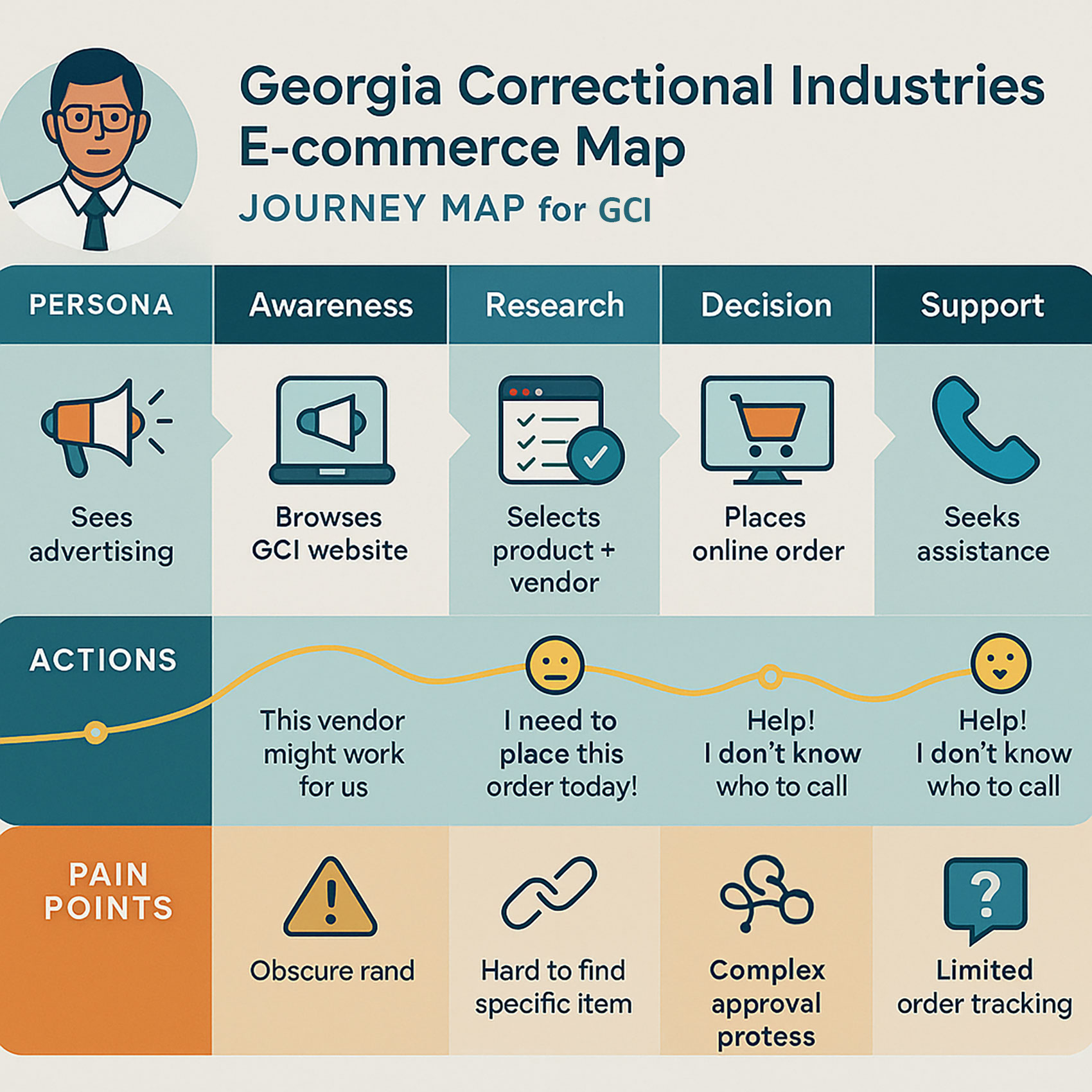
GCI Journey Map
GCI Journey Map

Research, Planning & Design

The initial phase of the Hanson Dentistry website redesign focused on aligning stakeholder goals with a modern, user-centered approach to improve both the digital brand presence and patient engagement. This phase was essential to laying the groundwork for a successful rebrand and website transformation.

I worked closely with the client through a series of structured planning sessions to gather requirements, identify pain points in the existing site, and define a clear strategy for the redesign. Weekly meetings with executive stakeholders ensured that all business needs were understood, project timelines were met, and design decisions were aligned with user expectations.

Key Contributions During This Phase:

  • Stakeholder Discovery: Facilitated weekly strategy sessions to surface legacy website challenges and prioritize updates for functionality, accessibility, and branding.
  • User Behavior Analysis: Conducted research on how patients navigated the legacy website using analytics and heatmapping tools to identify friction points and content gaps.
  • SEO Strategy Development: Performed keyword research and metadata audits to build a strong SEO foundation, enhancing visibility in local and organic search results.
  • Product & Service Presentation: Explored best practices for dental service pages, resulting in a cleaner, more informative layout that supports patient decision-making.
  • Information Architecture Planning: Created a streamlined site structure, reducing click depth and allowing users to access key services within one to two clicks.
  • Wireframing & Layout Design: Developed wireframes and UI mockups focused on readability, trust-building, and visual clarity tailored to a healthcare audience.
  • Brand Alignment: Began defining a modern design system—typography, color palette, and iconography—that reflected the professionalism and care associated with the Hanson Dentistry brand.

This phase resulted in a clearly defined UX framework, streamlined content hierarchy, and a comprehensive roadmap for both rebranding and technical execution—ensuring that all design decisions supported the project’s broader goal: improving brand trust and increasing product sales.

Navigation Through the Eyes of the User

During the UX evaluation and redesign of the Hanson Dentistry website, I conducted extensive research and usability testing to uncover key pain points in how users were interacting with the previous site. The findings revealed that visitors often struggled to locate important content—such as forms and documents—and were overlooking critical resources due to poor visibility, disorganized structure, and a lack of accessible navigation.

The legacy menu was neither intuitive nor inclusive, failing to support users with disabilities or those unfamiliar with the brand’s digital structure. Additionally, navigational behavior suggested that users were relying heavily on trial-and-error rather than being guided through a purposeful user flow.

Key Solutions Implemented:

  • Information Architecture Redesign:Developed a comprehensive flowchart to restructure the site’s content hierarchy, allowing for more intuitive navigation and faster content discovery.
  • Accessible Navigation System: Designed and developed a fully 508-compliant main menu, ensuring compatibility with screen readers, keyboard navigation, and assistive devices.
  • Content Visibility Enhancements: Strategically repositioned key documents and service links to ensure they were prominently featured and accessible within one to two clicks.
  • Mobile-Friendly Design: Ensured that all navigation elements were optimized for mobile and tablet devices, maintaining consistent usability across all screen sizes..
  • Same-Window Navigation: Standardized internal link behavior to open in the same browser window, improving back-button functionality and preserving user session flow.
  • Breadcrumb Trail Integration: Implemented breadcrumb navigation across subpages to support orientation, allowing users to easily trace and revisit previously viewed content.

These changes significantly enhanced the overall user experience, reduced friction in the customer journey, and ensured compliance with accessibility standards—ultimately positioning Hanson Dentistry as a more user-friendly and inclusive digital healthcare provider.

Graphic of site construction and user navigation
User flow & sitemap diagram
Illustration of roadblocks and solutions
Overcoming stakeholder and budget hurdles

Challenges & Hurdles

The redesign and rebranding of the Hanson Dentistry website presented a variety of strategic and interpersonal challenges that extended beyond design and development. As the lead on the project, I was not only responsible for delivering a high-performing website, but also for navigating internal resistance, budget constraints, and operational bottlenecks that threatened to delay or derail the process.

Several stakeholders were initially reluctant to embrace the redesign, questioning the need for a modernized visual identity and updated user experience. Political dynamics among team members, along with a general resistance to digital change, led to communication breakdowns and decision-making delays. Additionally, the project was constrained by a limited budget, which affected access to premium design tools and resources.

Key Challenges Encountered:

  • Stakeholder Misalignment: Some internal parties resisted the rebranding effort, preferring the familiarity of the legacy system and design, which slowed consensus and approval cycles.
  • Budget Limitations: Financial constraints required careful planning and creative problem-solving to deliver a high-quality product without the use of costly third-party tools or plugins.
  • Content Gaps: Much of the content from the original site was outdated, incomplete, or misaligned with the redesigned structure. I led a content discovery and reorganization effort to ensure accuracy and relevance.
  • Unwillingness to Embrace Change: Some team members hesitated to adopt new UX strategies or technologies, requiring me to present user research and data to demonstrate the long-term value of modernization.
  • Rebranding Resistance: The initiative to refresh the visual identity was initially met with skepticism, requiring multiple rounds of stakeholder education and visual concepting to gain buy-in.
  • Despite these hurdles, I remained focused on aligning the project with user needs and business goals. Through strategic communication, iterative testing, and persistent stakeholder engagement, the project was successfully delivered—resulting in a modern, accessible, and patient-friendly website that supports long-term growth for Hanson Dentistry.

Testing & Quality Assurance

As part of the final phase of the Hanson Dentistry website redesign, I conducted a comprehensive testing and quality assurance process to ensure the site was responsive, secure, accessible, and functionally sound across all environments. The primary goal was to validate that the site delivered a seamless and consistent experience, regardless of device, browser, or user interaction patterns. We employed exploratory usability testing with multiple user groups, allowing participants to freely interact with the site without direction. This method revealed real-world behavioral insights and surfaced hidden usability issues that might have otherwise gone undetected in scripted testing scenarios. Testing was conducted across multiple devices (desktop, tablet, and mobile) and modern browsers (Chrome, Firefox, Safari, Edge) to confirm cross-platform performance and interface consistency.

Testing Objectives:

  • Responsive Behavior Validation: Ensured the website displayed and functioned properly across various screen sizes and orientations, maintaining visual and structural integrity.
  • Cross-Browser Compatibility: Identified and resolved layout discrepancies and scripting issues that varied between browsers to maintain a consistent user experience.
  • Performance Optimization: Assessed and refined loading speeds, form interactions, and image rendering to enhance the overall site responsiveness and usability.
  • SEO & Indexing Readiness: Validated metadata, alt attributes, heading structures, and URL hygiene to support improved search engine indexing and crawlability.
  • Security & Data Integrity: Evaluated form submissions and backend processes to confirm that user data was securely transmitted and that common vulnerabilities were addressed (e.g., form injection, spam filtering).
  • Accessibility Compliance: Tested navigation using screen readers and keyboard-only functionality to ensure the site met Section 508 and WCAG 2.1 AA accessibility standards.

The insights gained from this testing phase enabled targeted refinements, resulting in a highly polished and reliable site that delivers a consistent, patient-friendly experience across all digital touchpoints.
Multidevice QA & usability tests