
Graphic Design · UX/UI Thinking · Visual Systems · Information Design · Project Management
Turning antibiotic stewardship guidance into a patient-ready communication system.
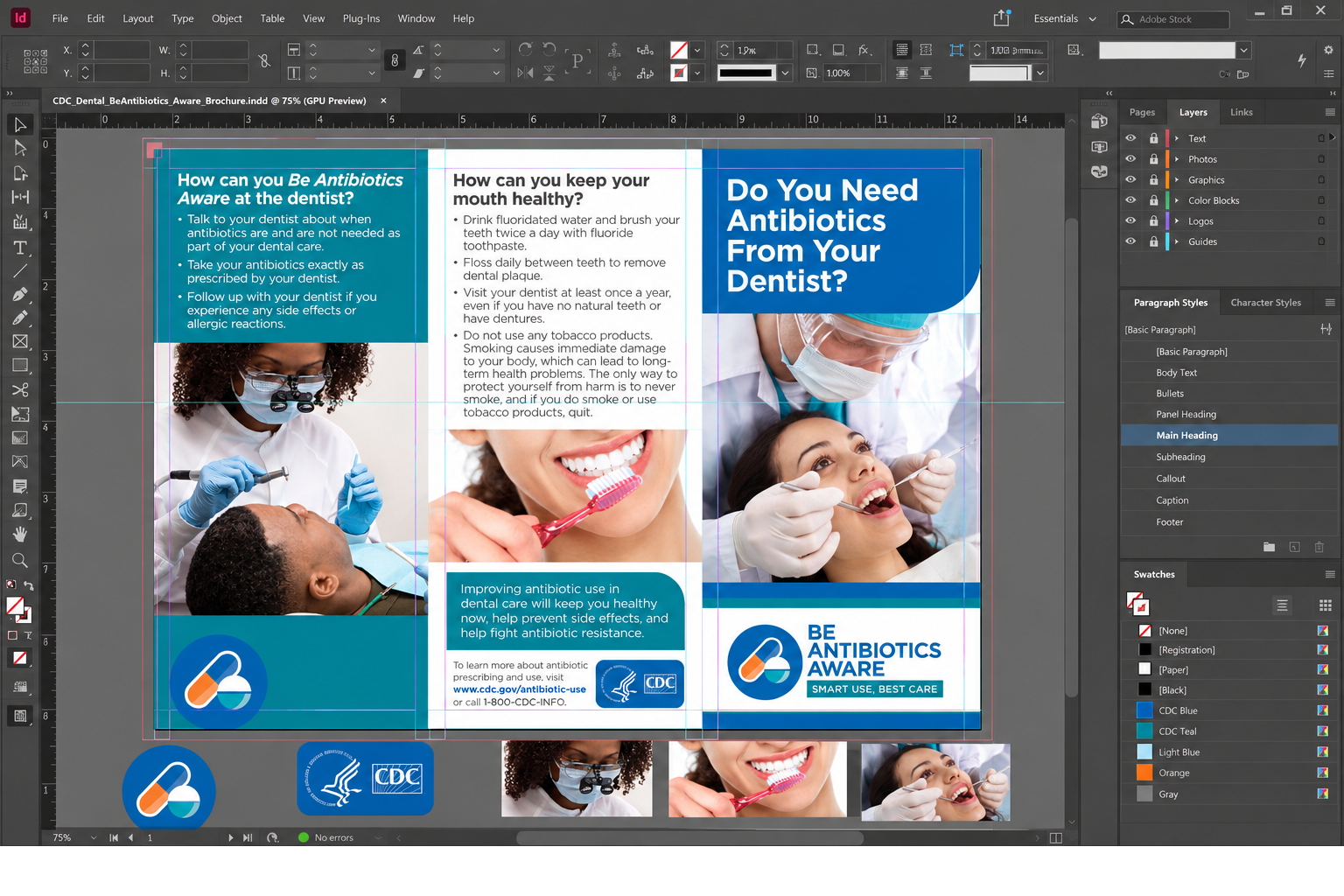
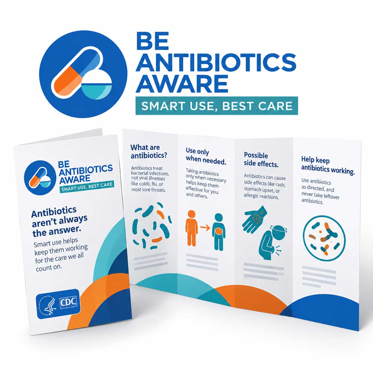
For CDC's Be Antibiotics Aware dental brochure, I translated dense clinical guidance into a six-panel experience designed to help patients scan, understand, and act on essential information.
The work combined editorial design, reusable campaign assets, information hierarchy, data emphasis, stakeholder review, and print-production discipline - with system consistency guiding every panel.
Project overview
The challenge was to organize medical guidance without making the brochure feel clinical, dense, or difficult to navigate.
I treated the tri-fold like a compact interface: define the user's reading path, establish reusable visual rules, and make every panel serve one clear communication purpose.
Graphic design, UX/UI thinking, information architecture, visual-system definition, asset coordination, and print-production support.
Dental patients needing clear guidance, with dental professionals able to use the brochure as a conversation aid.
Reusable color, type, icon, image, callout, and panel patterns kept the communication consistent across both sides.
A print-ready CDC tri-fold brochure supported by modular Illustrator assets and an InDesign production file.
The challenge
Antibiotic use, side effects, resistance, dental treatment, and patient actions all had to fit into one small folded format.
The goal
Create a credible, approachable piece that helps readers find the right information quickly without losing clinical context.
The response
Build a modular visual system, prioritize action-oriented content, and use repeated patterns to lower cognitive load from panel to panel.
Audience + UX/UI thinking
I designed the reading experience around what a patient needs to understand first, not around the order the source content arrived.
The brochure supports quick scanning in a care environment. Large questions establish orientation, bullets reduce reading friction, and high-value callouts make the next action obvious.
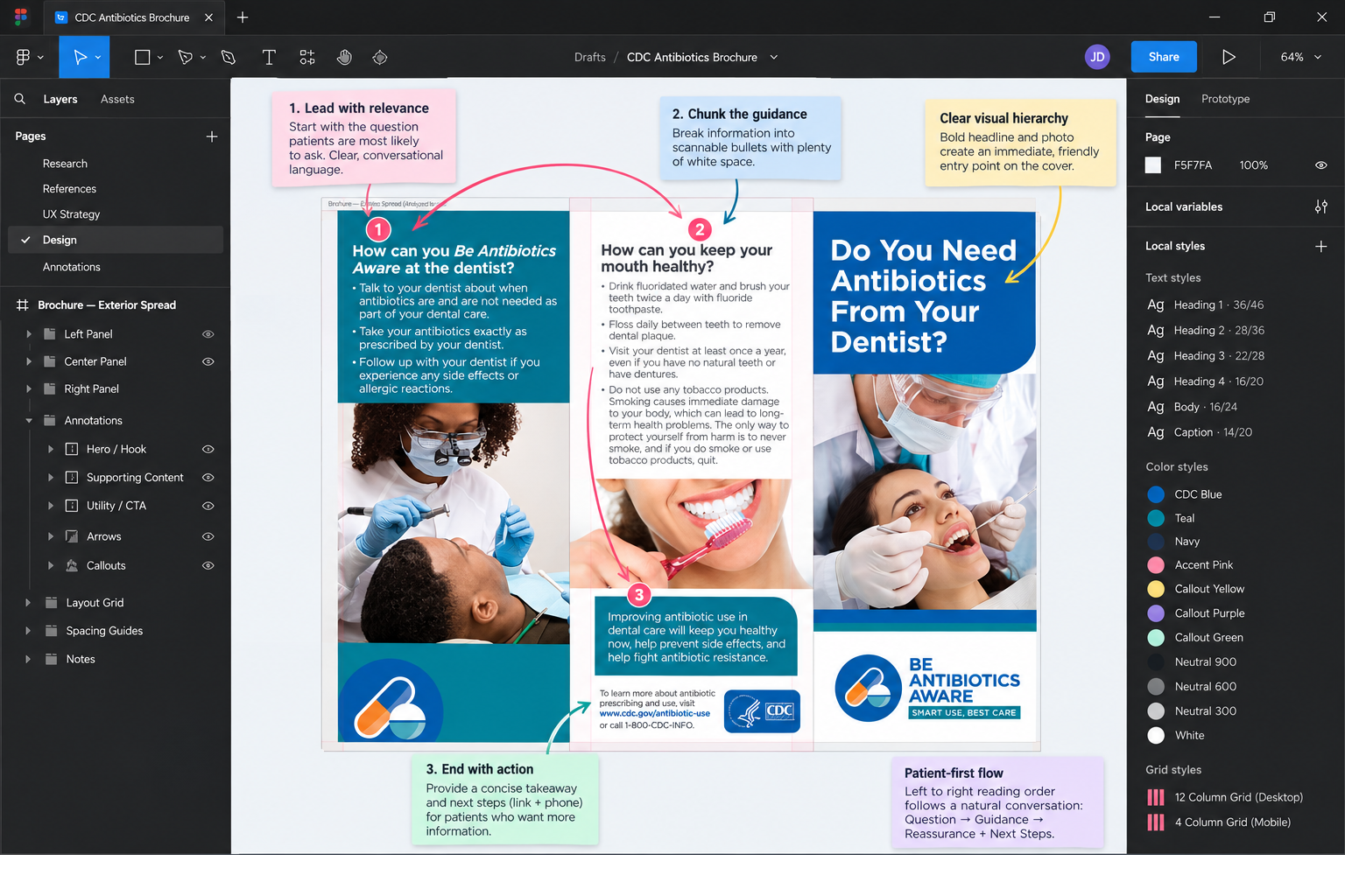
- Lead with relevance: Start with the question patients are most likely to ask - whether antibiotics are needed.
- Chunk the guidance: Separate treatment, side effects, resistance, and oral-health behaviors into distinct information zones.
- Design for scanning: Use strong headings, bullets, images, and short callouts instead of uninterrupted text.
- Build trust: Keep CDC identity, campaign branding, source information, and clinical imagery visible without overwhelming the message.
Information architecture
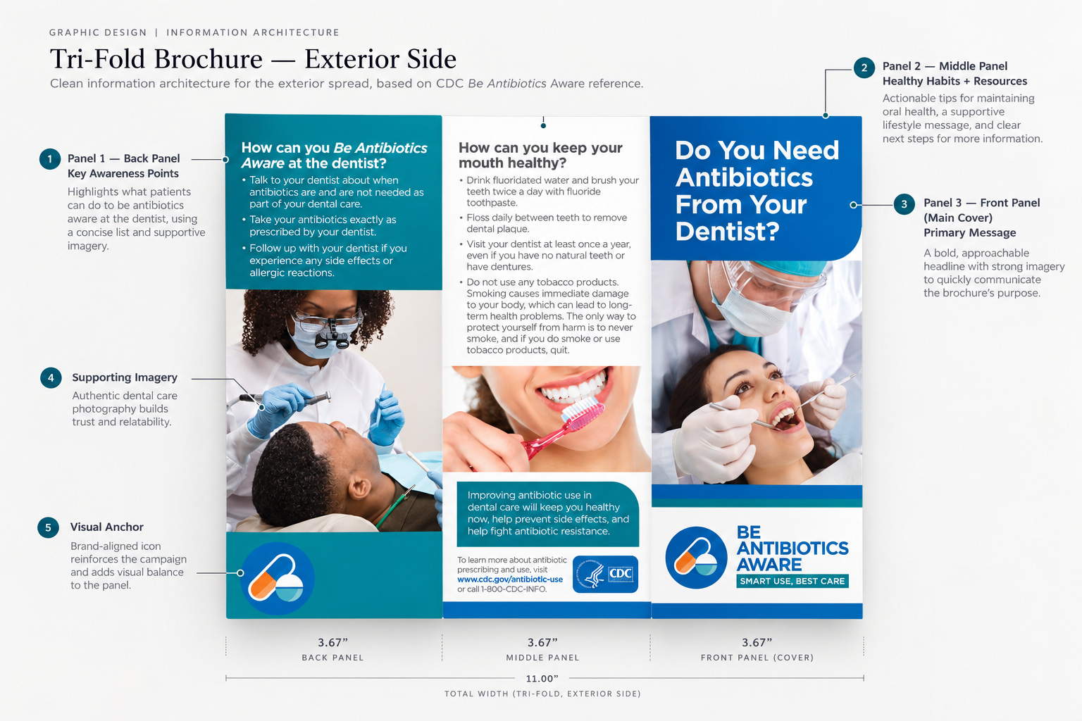
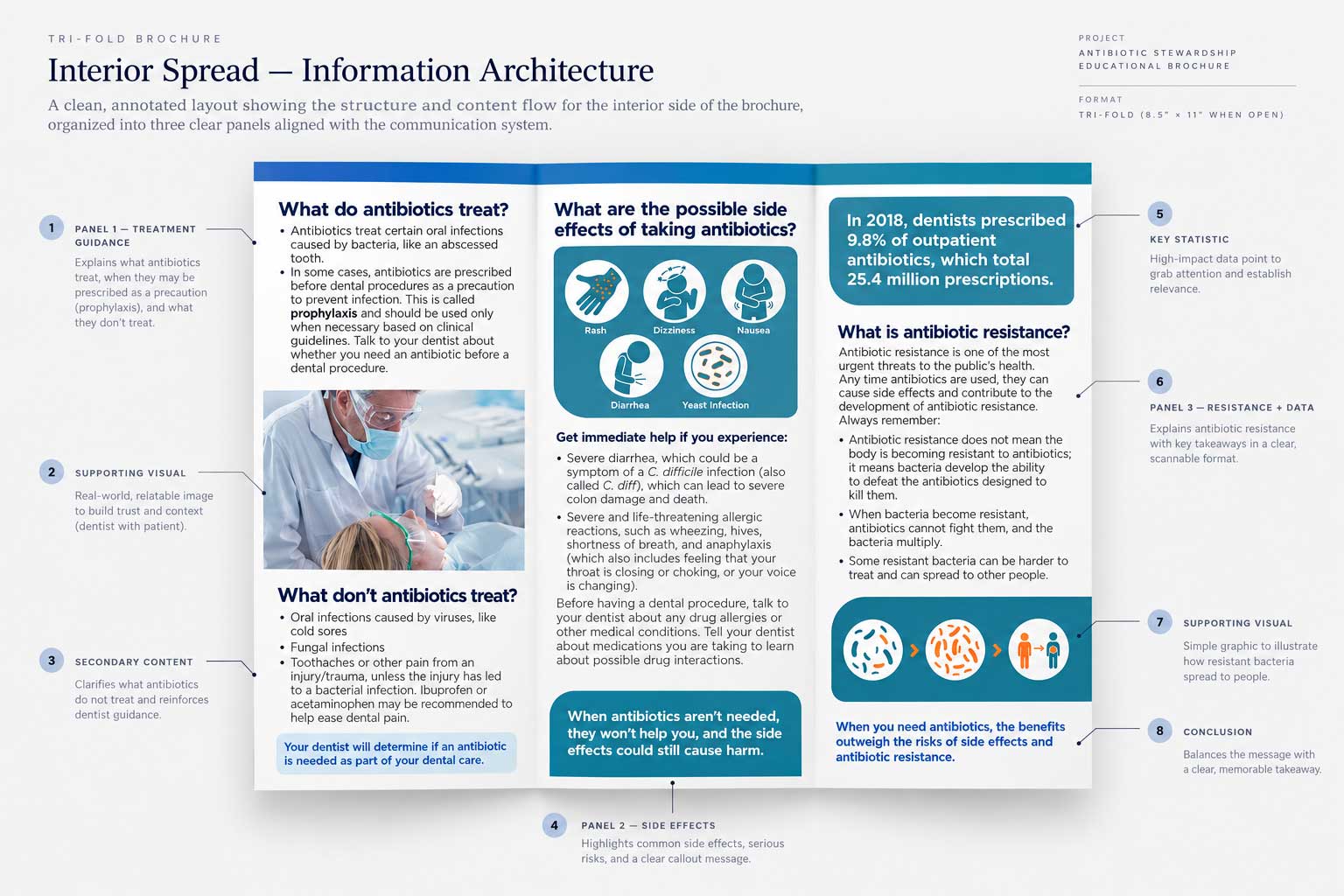
I treated the tri-fold as a six-panel interface with a deliberate reading path.
Each panel has one primary job. That makes the folded experience easier to enter from different points while preserving a coherent message when the brochure is fully opened.
Patient actions
What to ask, take, and follow up on.
Oral health
Preventive behaviors and reinforcing guidance.
Cover / entry point
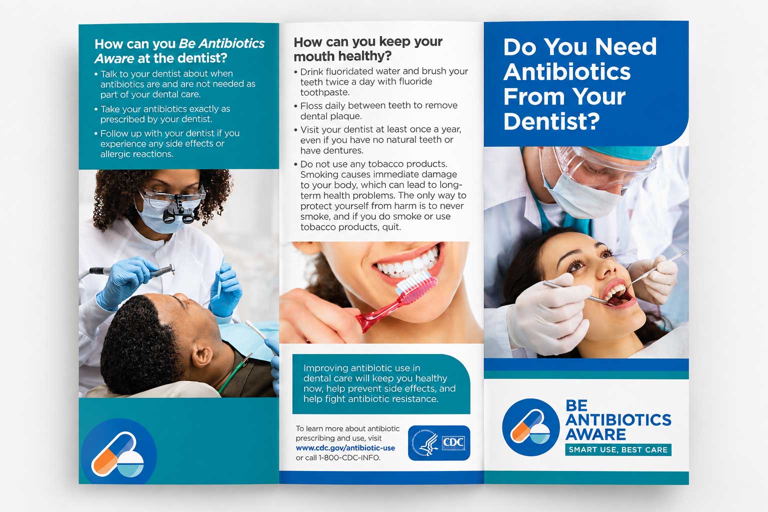
A direct question, clinical image, and campaign identity.
Treatment guidance
What antibiotics treat and what they do not.
Side effects
Risk cues, symptoms, and when to seek help.
Resistance + data
One key statistic, resistance explanation, and final takeaway.
Visual system + reusable design rules
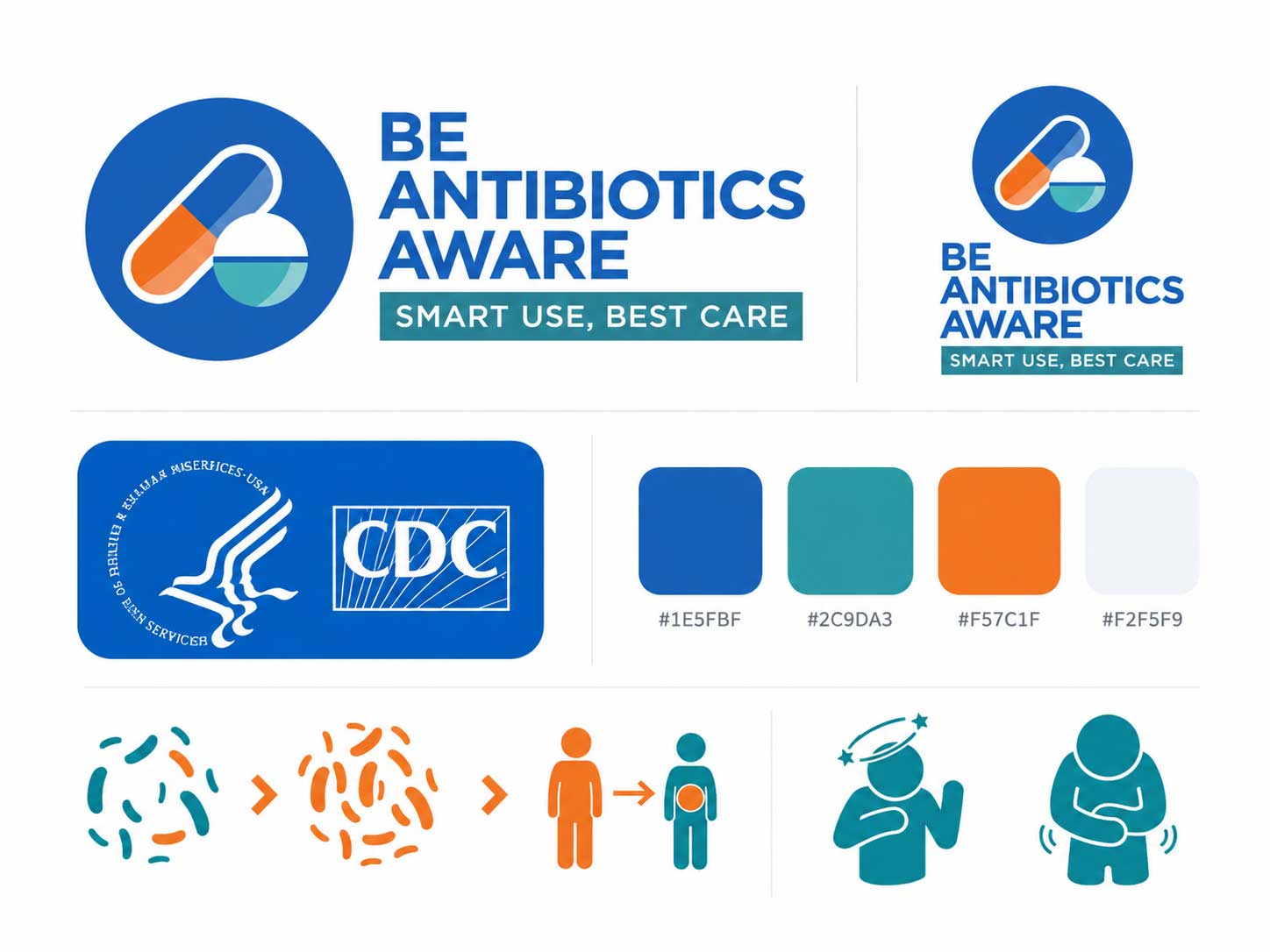
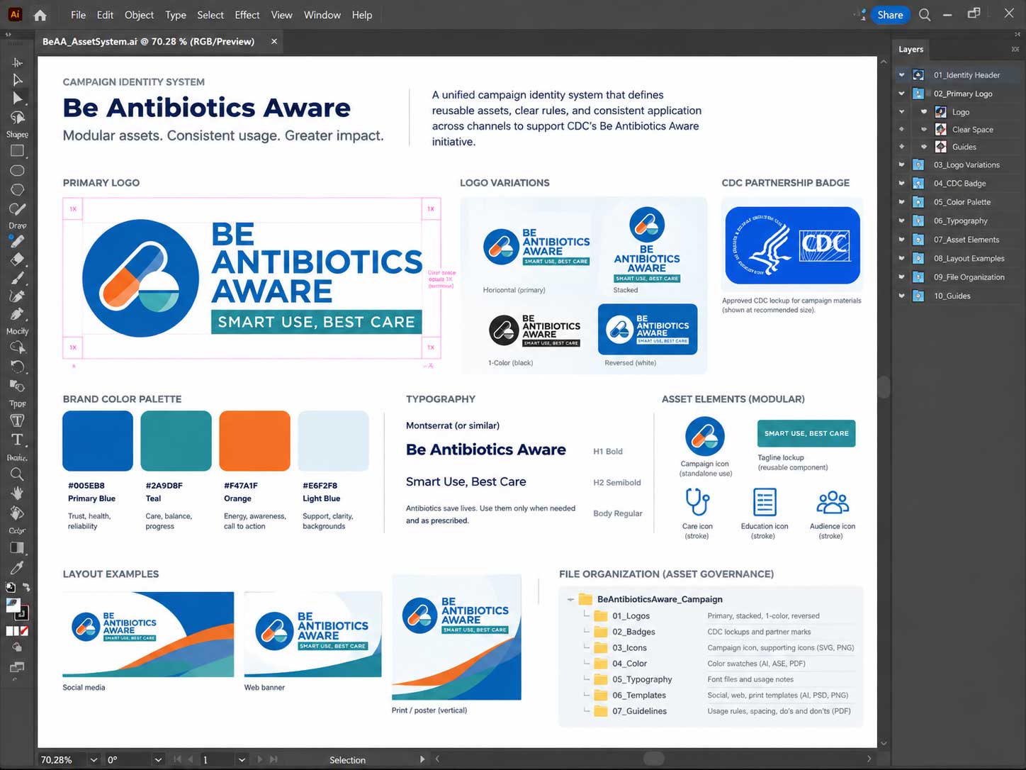
I built consistency through tokens, repeatable components, and a managed asset library - not by styling each panel independently.
The scope was a campaign communication system rather than an enterprise product library, but the transferable design-system behaviors are the same: define reusable rules, separate components from content, and protect consistency through QA.
One health-focused palette
Predictable hierarchy
Content patterns repeat
Brand assets stay modular
Component reuse
Headings, bullets, image blocks, statistics, and callouts follow repeatable patterns instead of one-off treatments.
Asset governance
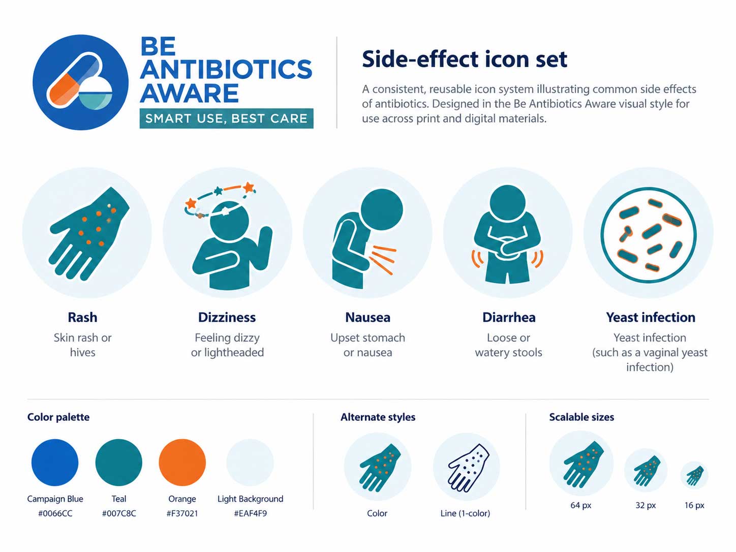
Campaign logo, CDC badge, bacteria illustration, and side-effect icon set were maintained as separate source assets for controlled reuse.
Layout rules
Panel boundaries, spacing, rounded callouts, imagery, and hierarchy stay consistent across the exterior and interior spreads.
Quality control
Consistency checks protect typography, linked assets, brand application, fold-aware placement, and print-ready output.
Data visualization + iconography
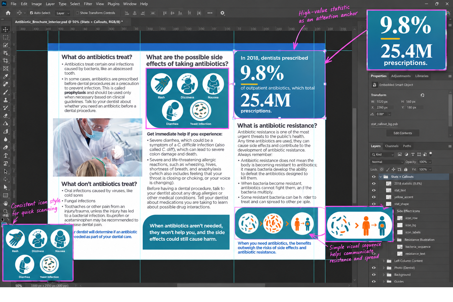
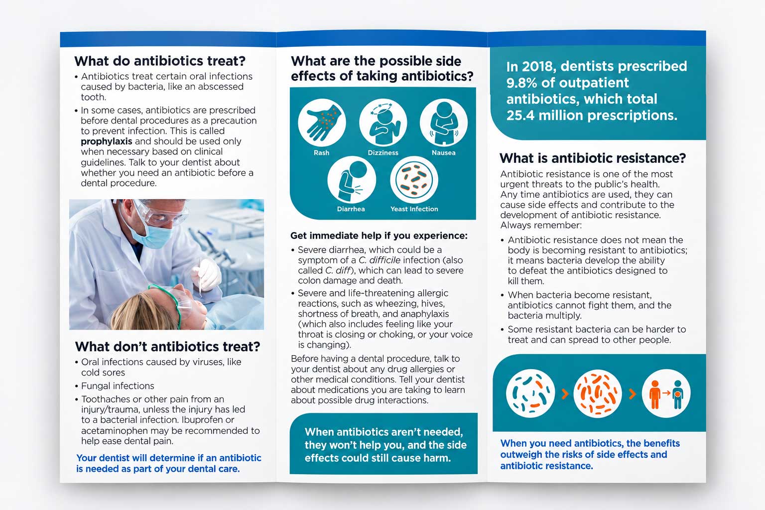
The brochure uses data selectively: one high-value statistic becomes an attention anchor, while icons make risk information easier to scan.
This was not a dashboard. The information-design decision was to emphasize the statistic that added context, then support more complex health concepts with simple visual cues.
of outpatient antibiotics were prescribed by dentists
25.4Mprescriptions represented by that share
Visual priority
The statistic sits inside a high-contrast teal callout so it can be understood before the reader reaches the longer resistance explanation.
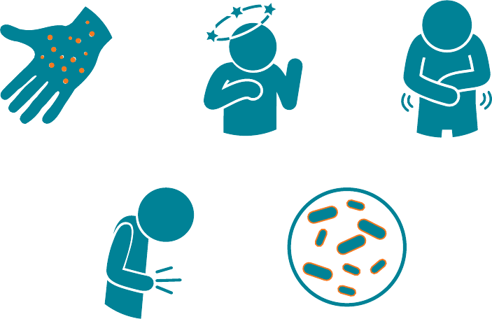
Side effects become scan targets
Illustrated symptoms create faster visual entry points than text alone and maintain a consistent teal-and-orange visual language.
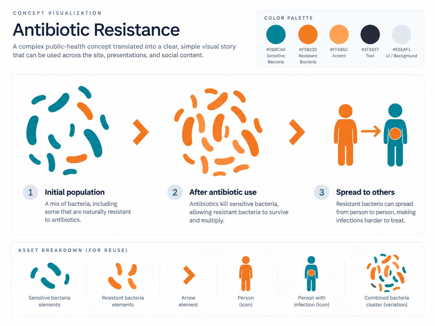
Resistance becomes a simple sequence
The illustration reduces an abstract public-health concept to a left-to-right visual story that supports the written explanation.
Project management + production
The design work also required coordinating content, linked assets, revisions, and print constraints as one production system.
I structured the work so creative decisions and production decisions stayed connected - reducing the risk of visual inconsistency, broken assets, or last-stage layout problems.
-
01
Requirements + content inventory
Identify audience needs, campaign requirements, statistics, clinical guidance, logos, illustrations, and final print specifications.
-
02
System + layout build
Establish grid, panel roles, typography, color, callouts, image treatments, and reusable Illustrator assets inside the InDesign layout.
-
03
Review + refinement
Coordinate content and design feedback, refine hierarchy, confirm labels and visuals, and keep changes synchronized across both sides.
-
04
Preflight + handoff
Verify linked assets, image quality, fold-aware placement, typography, brand consistency, and print-ready PDF output.
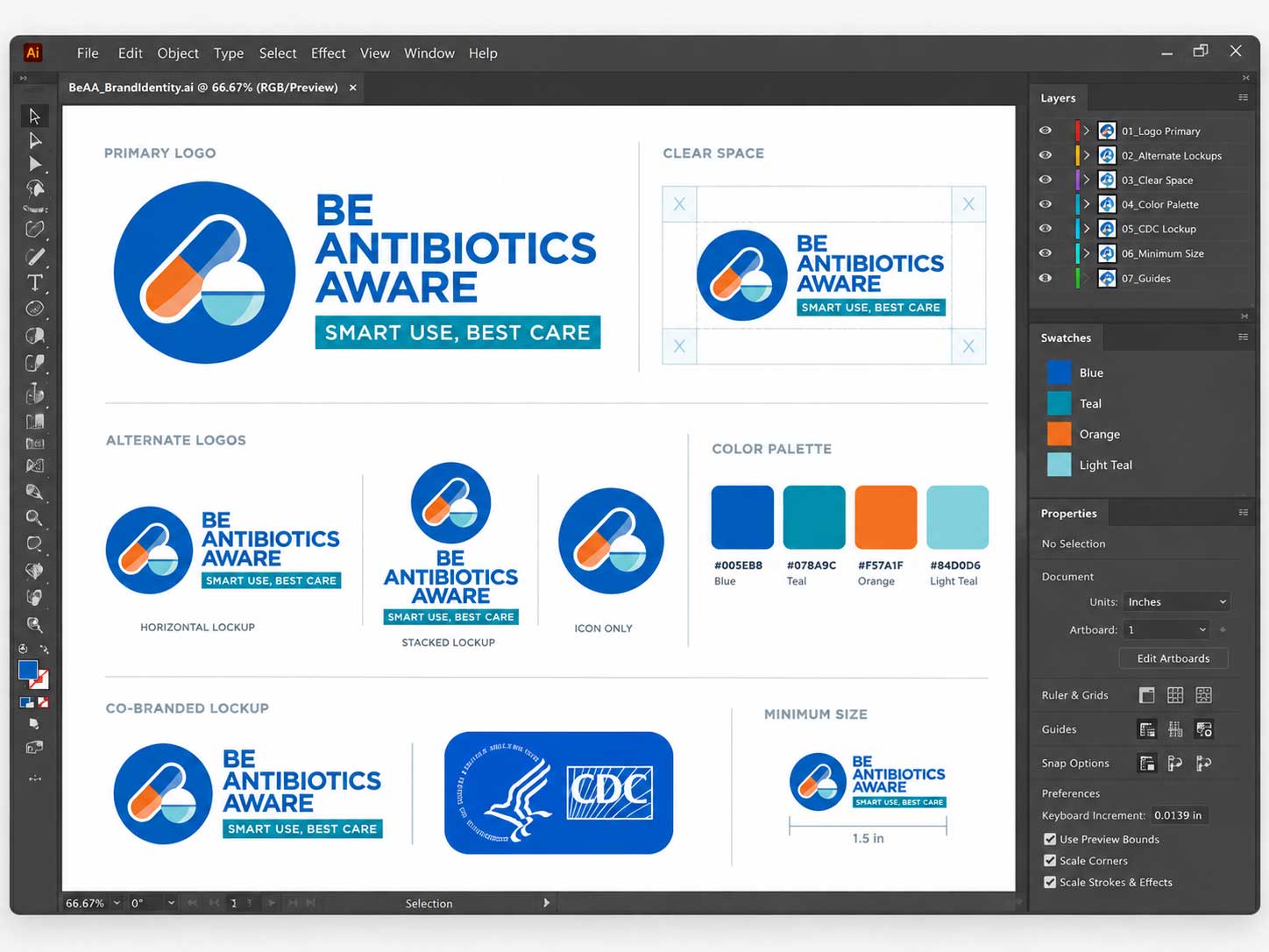
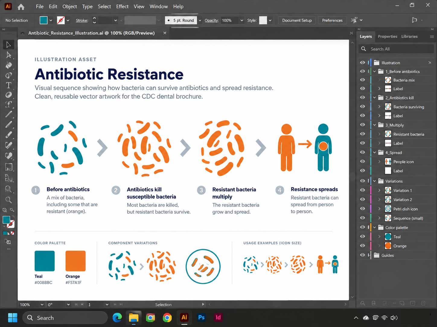
Final artwork
Two sides, six panels, one consistent communication system.
The finished brochure connects campaign identity, clinical guidance, photography, data, icons, and action messaging without making any one element compete with the whole.
Design value
The final piece turns a dense health topic into a structured, reusable, production-ready communication experience.
Clearer user journey
Panel roles and visual hierarchy give patients a predictable path from question to guidance to action.
Systemized visual language
Reusable tokens, components, and source assets make the design easier to maintain and extend consistently.
Production-ready execution
Layout discipline, linked-asset management, brand control, and preflight thinking support reliable print delivery.
Design perspective