Visual Metaphor
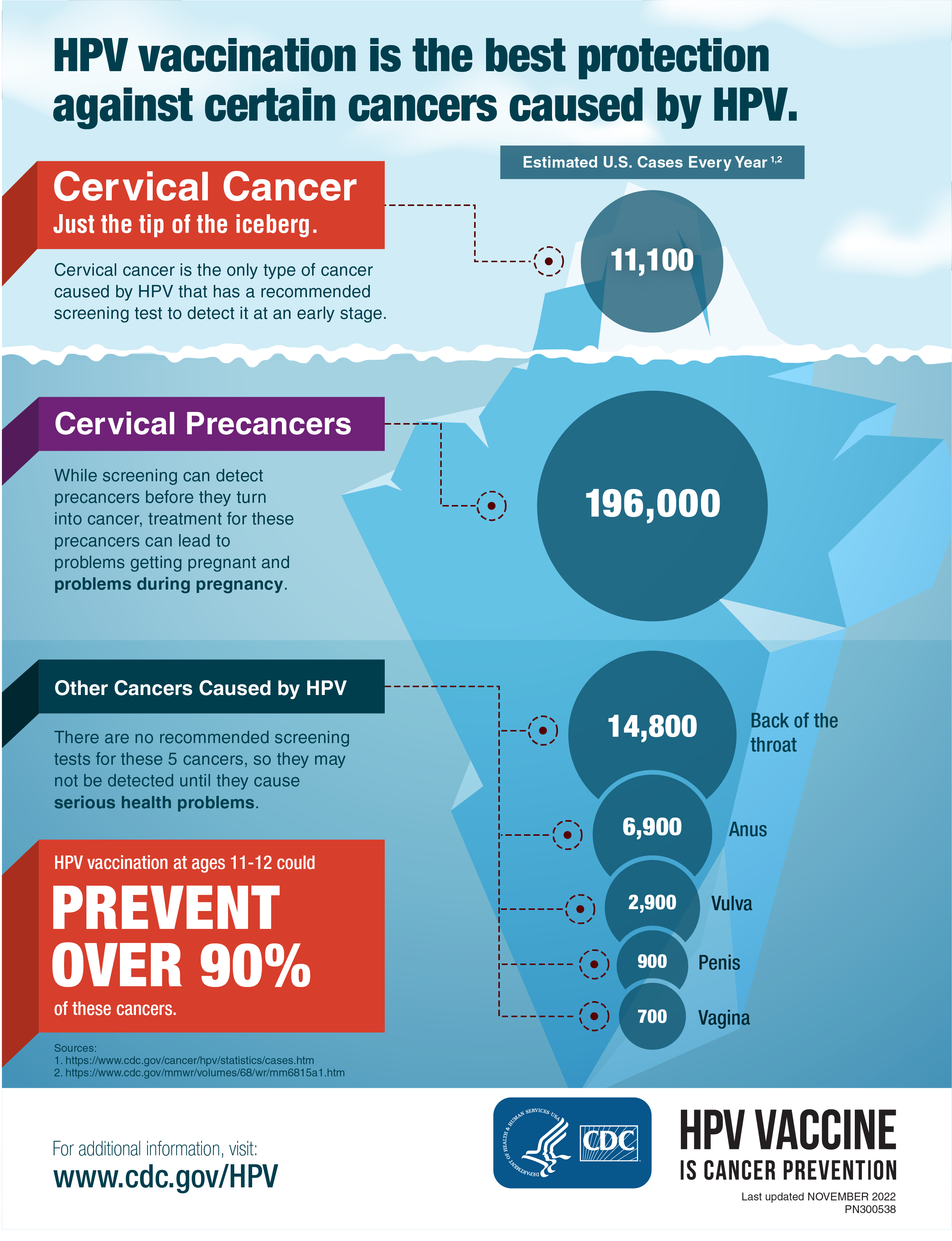
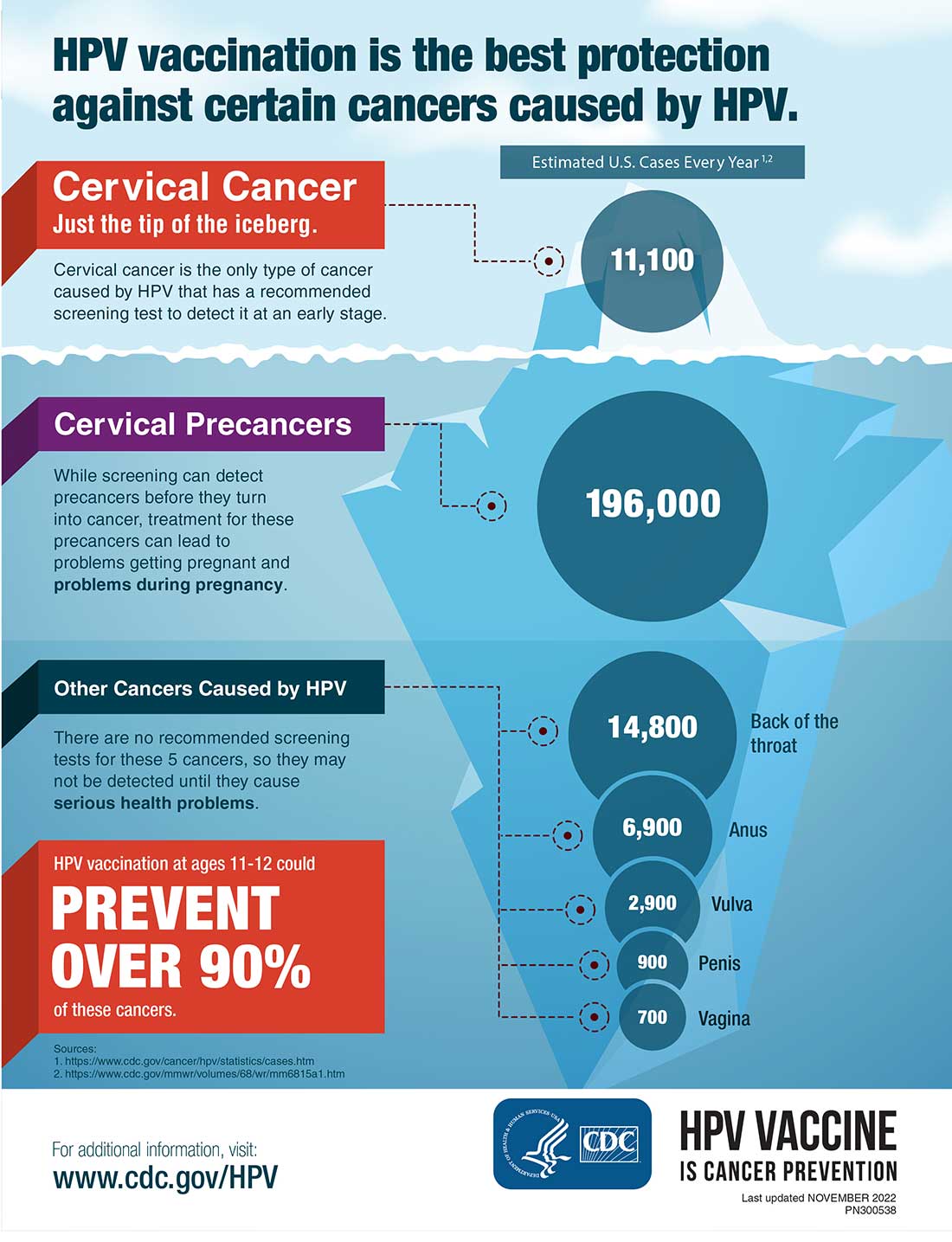
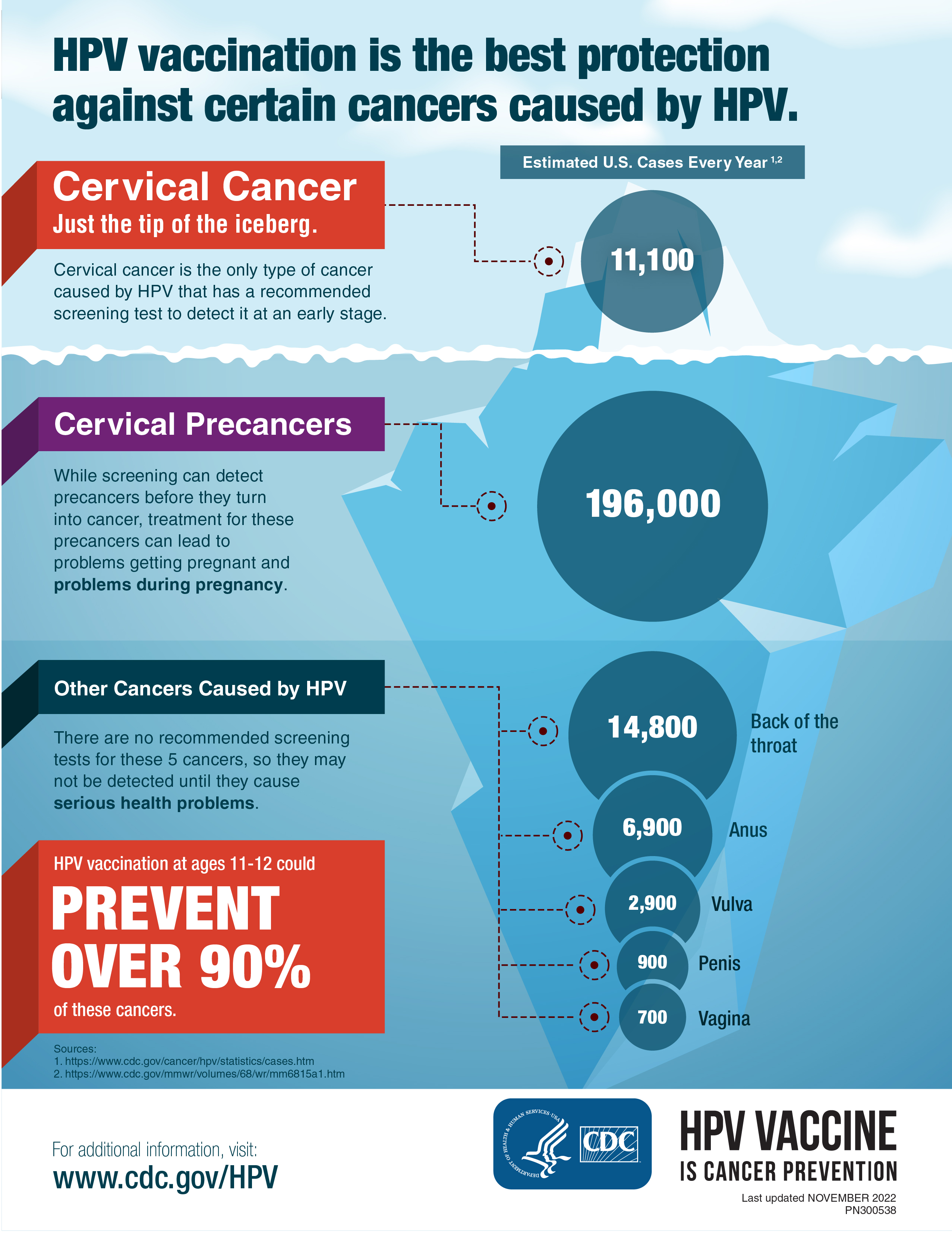
The iceberg concept helped communicate that cervical cancer is only part of the larger HPV-related cancer burden.
For this CDC HPV vaccination infographic, I translated complex cancer-prevention information into a clear, visual story designed for caregivers, young adults, clinicians, and public-health audiences. The goal was to make the connection between HPV vaccination and cancer prevention easier to understand without relying on dense medical language or statistics alone.
My design approach centered on a strong visual metaphor: the iceberg. The visible portion represents cervical cancer, while the larger structure below the surface communicates the broader range of HPV-related cancers. This design decision helped turn abstract epidemiological information into a more intuitive visual narrative that audiences could understand quickly.
The final piece uses a healthcare-inspired blue palette, scaled data bubbles, clear section hierarchy, high-contrast typography, and CDC-aligned visual cues to support both print and digital use. The result is a polished, accessible infographic that balances public-health credibility with a more human-centered prevention message.
The iceberg concept helped communicate that cervical cancer is only part of the larger HPV-related cancer burden.
Scaled bubbles, grouped labels, and clear visual zones helped make complex cancer statistics easier to compare.
A bold prevention callout reinforced the value of vaccination and gave the audience a clear takeaway.
The primary audiences for this infographic were caregivers, young adults, clinicians, and public-health communicators who need to understand or explain the value of HPV vaccination. Because vaccine-related decisions can involve hesitation, uncertainty, or limited health literacy, the design needed to feel clear, credible, and approachable.
The communication goal was to make the prevention message easy to grasp in seconds. The infographic needed to show that HPV is connected to more than one cancer type, explain the broader cancer burden visually, and reinforce vaccination as a meaningful prevention tool.
The creative direction centered on visualizing hidden risk. I used the iceberg metaphor to show that the most familiar association, cervical cancer, is only the visible portion of the HPV-related cancer story. The larger structure below the surface helped communicate that HPV can contribute to multiple cancer types.
The visual strategy used cool healthcare blues to establish trust and stability, with targeted accent colors to highlight priority messages and section changes. Scaled circular data graphics were used to make cancer burden easier to compare, while dotted guide lines, icons, and compact labels helped move the viewer through the information without creating unnecessary visual clutter.
I structured the infographic around a modular layout that guides the viewer through a clear sequence: understand the risk, compare the impact, and remember the prevention message. This helped the piece function as both a standalone flyer and a supportive conversation tool.
The final infographic transforms complex public-health information into a visual prevention story that is easier to scan, remember, and discuss. By combining metaphor, hierarchy, and simplified data visualization, the piece helps audiences understand the broader relationship between HPV and cancer prevention.
From a design standpoint, the value is in how the piece reduces cognitive load. It does not ask the viewer to interpret a dense report or compare statistics manually. Instead, the layout guides the eye through the story, highlights the key prevention message, and supports CDC’s role as a credible public-health communicator.