Three-Pillar Structure
Safety, wellness, and support categories helped organize a wide range of services into a clear and memorable framework.
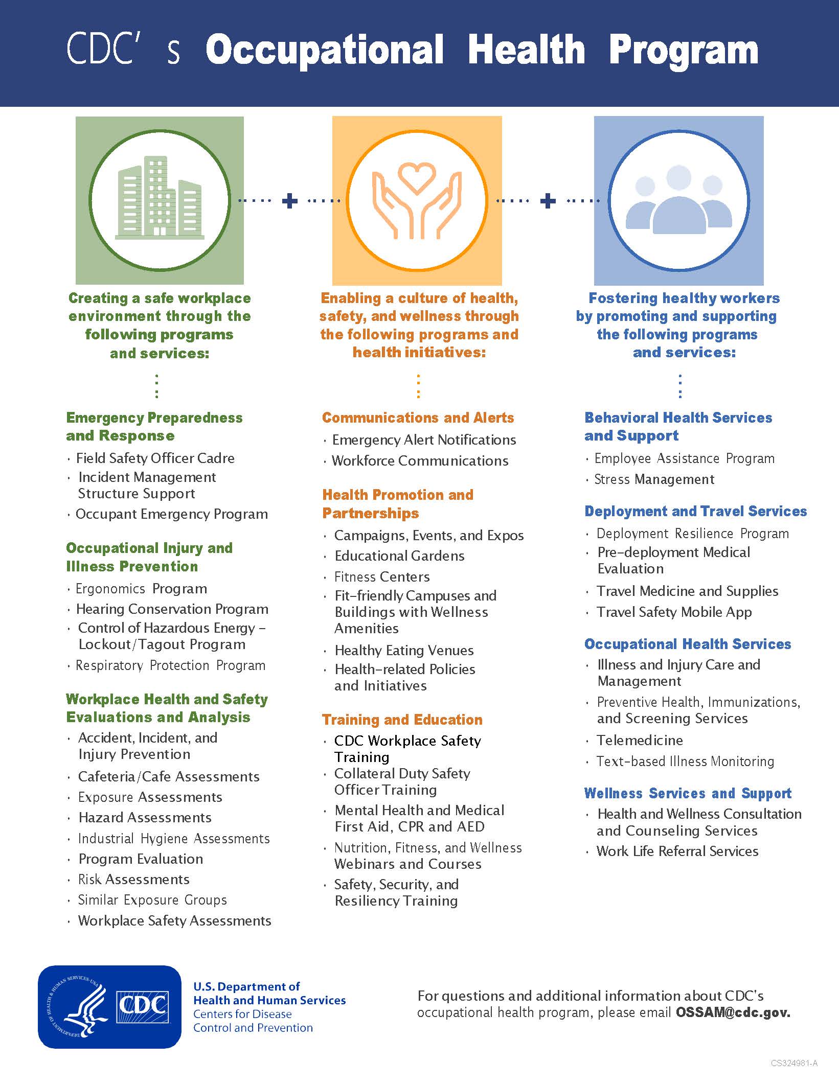
For CDC’s Occupational Health Program one-pager, I designed a concise visual communication piece that organized a broad set of employee health, safety, wellness, emergency response, behavioral health, and travel-support services into one clear, accessible overview. The goal was to make the program easier to understand, easier to reference, and easier to communicate across internal teams and leadership audiences.
My process started with content prioritization and information grouping. I reviewed the range of services, identified recurring themes, and structured the information into a three-pillar framework: safety, wellness, and support. This gave the piece a stronger communication logic and helped transform a long service list into a more usable visual system.
The final design uses color-coded categories, simple iconography, strong typographic hierarchy, and a balanced one-page layout to help readers quickly scan the program’s offerings. The result is a polished internal communication asset that supports employee awareness, stakeholder briefings, and CDC’s broader commitment to workforce health and well-being.
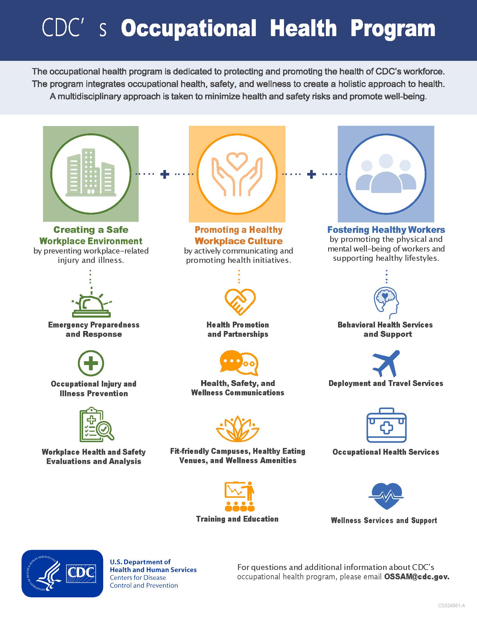
Safety, wellness, and support categories helped organize a wide range of services into a clear and memorable framework.
Color-coded columns, concise labels, and icon cues made the information easier to navigate without overwhelming the reader.
The one-page format gave CDC teams a polished resource for employee awareness, leadership briefings, and program promotion.
The primary audience for this one-pager included CDC employees, program managers, leadership teams, and internal stakeholders who needed a concise overview of the Occupational Health Program. Because the content covered multiple types of services, the design needed to support quick understanding while still presenting the program as comprehensive and credible.
The communication goal was to make the program easier to explain and easier to reference. I focused on creating a layout that could educate employees, reassure them about available resources, and help leadership communicate the program’s value in meetings, briefings, and internal communications.
The creative direction centered on clarity through categorization. I used a three-column system to separate the program’s services into safety, wellness, and support. Each pillar was assigned a distinct color treatment and paired with simple iconography so readers could quickly recognize service groupings before reading the supporting text.
Typography and spacing were used to create a strong visual rhythm. Bold section headers introduced each program category, while shorter supporting descriptions and bullet-style content kept the page easy to skim. The overall design needed to feel organized, trustworthy, and employee-centered rather than dense or administrative.
I treated the one-pager as a compact information system. Every section needed to work within a limited amount of space while still giving the reader enough context to understand the program’s breadth. The layout was structured to guide the eye from program identity to service categories and then to contact or next-step information.
The final one-pager turned a broad internal program offering into a clear and usable communication tool. Employees can quickly identify relevant services, while program managers and leadership teams can use the piece to communicate the Occupational Health Program’s scope and value in a professional format.
From a design standpoint, the value is in how the layout reduces complexity. The piece does not simply list services; it organizes them into a visual framework that supports awareness, trust, and action. By combining hierarchy, color coding, iconography, and concise messaging, the design makes the program feel easier to understand and easier to promote.