U.S. Opioid Dispensing Rates Data Story
For this CDC animated data visualization, I translated state-level opioid dispensing data into a clear, accessible, and visually guided motion story. The goal was to help public-health audiences quickly understand how dispensing patterns changed across the United States from 2006 to 2020 without requiring them to interpret raw data tables or dense statistical reports.
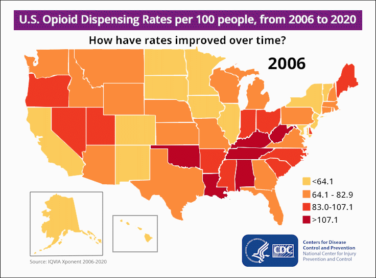
My design approach focused on turning a complex public-health issue into a structured visual experience. I used a color-coded severity scale, a year-by-year animation sequence, clear map hierarchy, and supporting reference elements to help viewers compare geographic patterns, follow the timeline, and recognize areas of improvement over time.
The final piece balances clarity, urgency, and credibility. The map carries the primary story, the animation adds rhythm and progression, and the CDC branding, legend, and supporting labels anchor the visualization as a trusted public-health communication tool.
- Client: CDC Overdose Prevention Team
- Role: Design-led, Visual Design, Layout, Illustration, Motion Graphics
- Tools: Adobe Photoshop, After Effects, Illustrator
- Deliverable:Animated U.S. data visualization
The visualization needed to communicate with multiple audiences, including public-health professionals, policymakers, healthcare stakeholders, and members of the public. The main goal was to make long-term opioid dispensing trends easier to understand at a glance while preserving the seriousness and credibility of the subject matter.
Because the data spans multiple years and every state, the design needed to do more than display information. It needed to guide viewers through change over time, help them compare regional patterns, and make the overall trend feel clear without overwhelming them with excessive labels or explanation.
The visual strategy centered on a clear severity-based color system. I used a warm progression from light yellow to deep red so viewers could quickly distinguish lower and higher dispensing rates. This helped create an immediate visual read while keeping the map simple enough for broad public understanding.
Typography was kept bold, minimal, and supportive. The headline frames the story as a question “How have rates improved over time?”, which gives the viewer a reason to follow the animation from beginning to end. The supporting legend, CDC branding, and map insets were positioned to provide context without competing with the central map.
The composition was structured around three primary layers: the map, the timeline, and the supporting reference elements. The U.S. map serves as the dominant focal point, while the year marker creates a clear temporal anchor. The legend and brand marks remain secondary but visible, allowing viewers to interpret the data without leaving the visual frame.
- Main map: Designed as the focal point so state-by-state changes could be understood quickly through color intensity.
- Timeline animation: Built to create a steady year-by-year progression, helping viewers recognize patterns of improvement and areas of continued concern.
- Legend and supporting marks: Positioned for fast reference while maintaining credibility, geographic context, and CDC brand consistency.
The final animation turned a complex, multi-year dataset into a visual story that could be understood quickly and shared more easily. By combining motion, color hierarchy, and a simplified map structure, the piece helped make opioid dispensing trends more visible, digestible, and emotionally resonant without sacrificing clarity.
From a design standpoint, the value of the piece is in how it reduces friction. Viewers do not need to study a spreadsheet to understand the broader pattern. The animation guides them through the story, allowing the visual system to communicate change, severity, and progress in a more immediate way.