
Product Design · Commerce UX · Design Systems · Front-End Development
GCI Digital Commerce Product Experience
Rebranding and restructuring a complex institutional product catalog into a clear, accessible, and scalable commerce experience.
I owned both design and hands-on website implementation across the GCI commerce experience—rebranding the digital storefront, organizing diverse product families, defining reusable UX/UI patterns, and developing responsive product experiences in Magento with HTML, CSS, and JavaScript.


Project overview
Turning a broad catalog into a more understandable product experience.
GCI’s catalog spans products with very different specifications, purchasing requirements, and decision points. My responsibility extended from product and visual design into front-end implementation, so the experience had to be both strategically coherent and practical to build, maintain, and scale within Magento.
Present a broad institutional catalog as one credible digital product experience instead of a collection of disconnected categories.
Help buyers quickly understand what is available, what details matter, and what action is appropriate for each product type.
Support furniture, chemicals, cleaning products, signs, documents, options, and multiple purchasing paths without fragmenting the UI.
Create clearer discovery, predictable decision-support patterns, accessible interactions, and a reusable foundation that can scale.
The challenge
A catalog built around many product types can become difficult to browse when categories, specifications, and purchase paths are not presented consistently.
The goal
Create a modern commerce experience that balanced institutional credibility with the clarity and usability people expect from contemporary retail platforms.
My response
I connected the digital rebrand, catalog structure, category templates, product pages, purchasing guidance, responsive UI, and front-end implementation into one scalable Magento commerce system.
Product design process
Research shaped the structure before visual polish shaped the interface.
I combined stakeholder interviews, competitive analysis, heatmap review, iterative wireframing, and testing with catalog, procurement, and platform requirements. That evidence informed the information architecture, page hierarchy, interaction patterns, and the responsive Magento implementation that followed.
-
01
Research the current experience
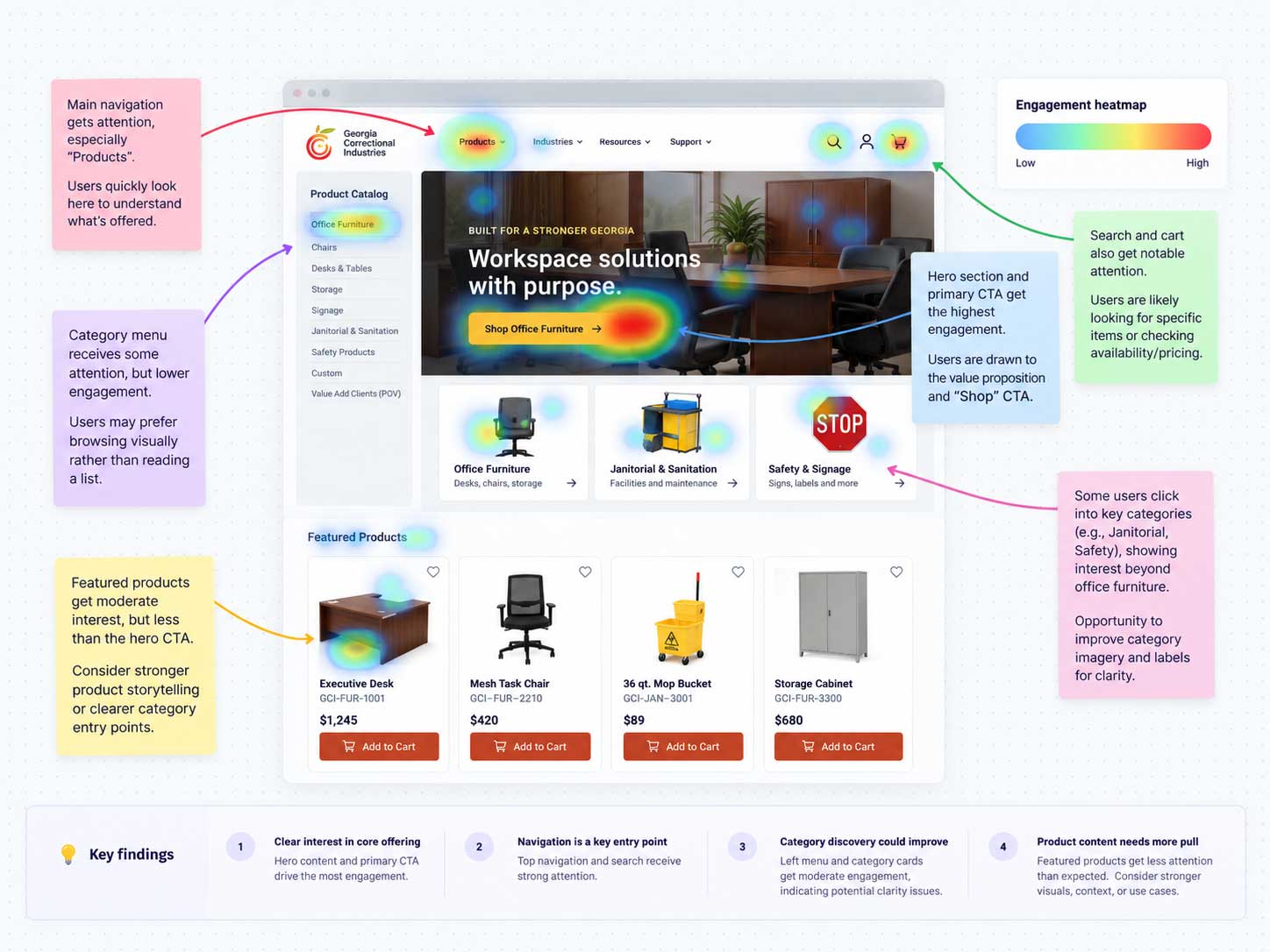
Review the existing catalog, product content, buyer pathways, and behavioral signals, including heatmaps to understand where the experience needed greater clarity.
-
02
Align with stakeholders
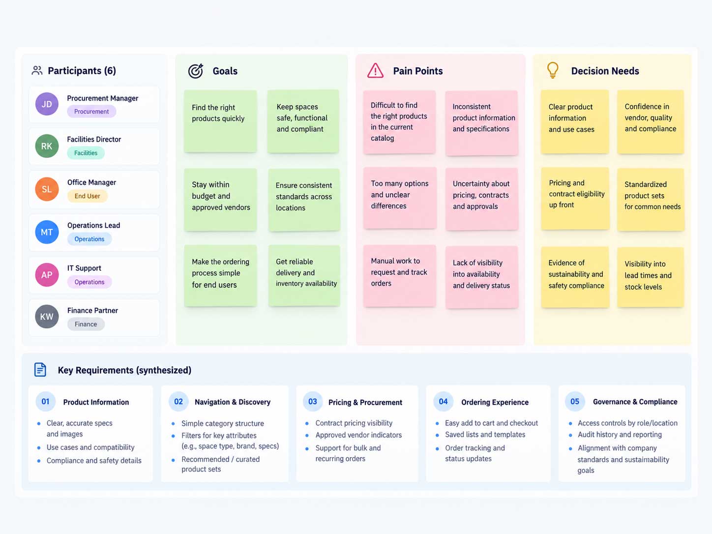
Use stakeholder interviews to clarify product requirements, institutional purchasing needs, content priorities, constraints, and the decisions different buyers must make.
-
03
Benchmark the market
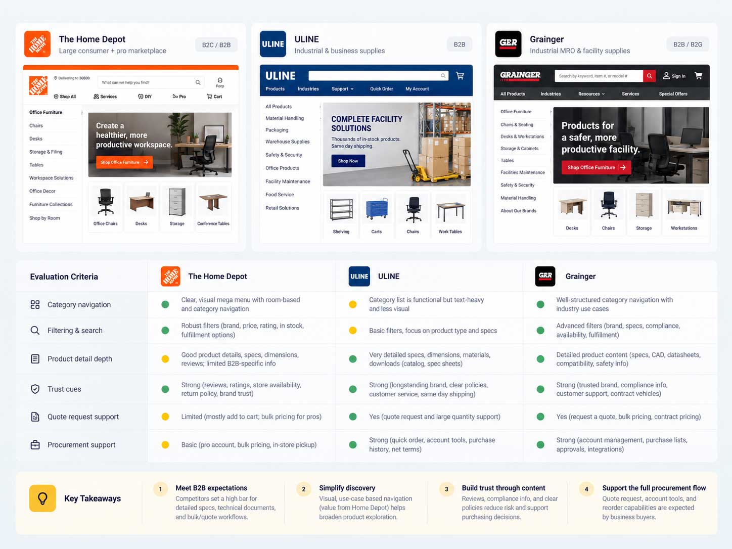
Compare commerce and institutional-product experiences to identify familiar patterns for navigation, filtering, product detail, trust, and conversion pathways.
-
04
Model the catalog
Translate the research into category relationships, labels, attributes, content hierarchy, buyer tasks, and product-page expectations before styling individual screens.

-
05
Wireframe, test, iterate
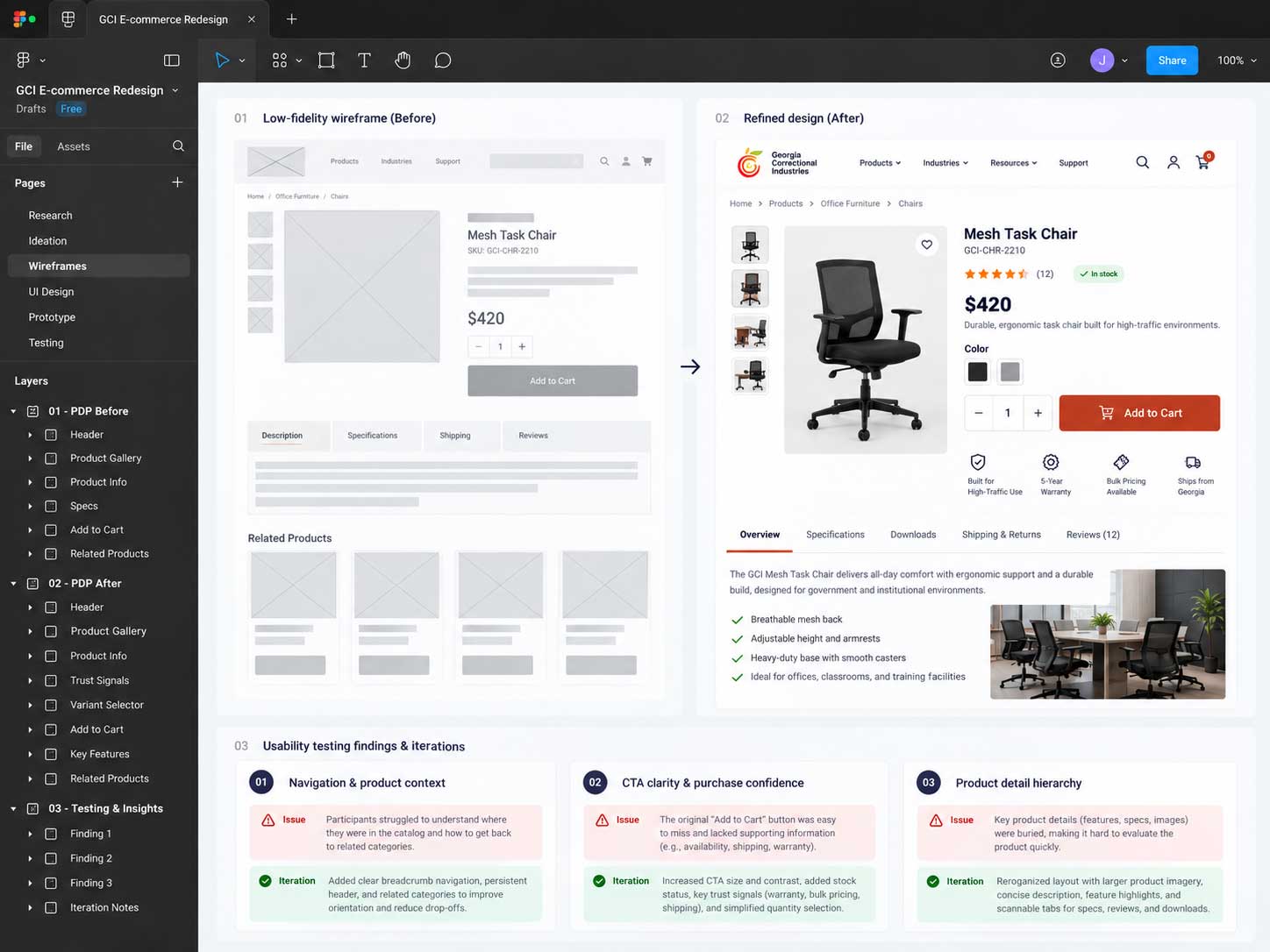
Explore alternative navigation, category, product-detail, and procurement flows through iterative wireframes and testing, then refine the strongest patterns.
-
06
Systemize, build + refine
Convert validated patterns into reusable components and responsive rules, then implement and refine the experience in Magento using HTML, CSS, and JavaScript while checking accessibility, content variability, interaction states, and production QA.
Research + validation
Each research method answered a different product question.
The goal was not to collect artifacts for the sake of process. Each method reduced uncertainty and translated into a concrete design decision.
What must the experience support?
Clarified product information, procurement requirements, business constraints, content priorities, and the needs different buyers bring to the catalog.
Which interaction patterns are already familiar?
Benchmarked category navigation, filtering, product-detail structures, trust cues, and purchase pathways across relevant commerce experiences.
Where is attention and interaction concentrated?
Used behavioral heatmaps to examine attention and interaction patterns in the existing experience and inform hierarchy, navigation, and placement hypotheses.
Can buyers find, understand, and act?
Iterated on lower-fidelity structures and task flows, tested how the experience communicated key decisions, and refined the patterns before final UI treatment.
Product ecosystem
Different products require different decision-making information.
The catalog was not treated as a flat collection of items. Each product family was considered according to the details, documents, options, and purchasing questions its buyers would need.
Office and park furniture
Dimensions, materials, finishes, installation context, product imagery, quantities, and lead times.

Chemicals
Use case, size or volume, handling information, supporting documentation, and institutional ordering needs.

Cleaning products
Compatible surfaces, applications, quantities, product variations, and clear supporting information.

Street and facility signs
Size, material, mounting, customization, message requirements, and quote or inquiry pathways.

Digital rebrand
Modernizing the brand without losing institutional trust.
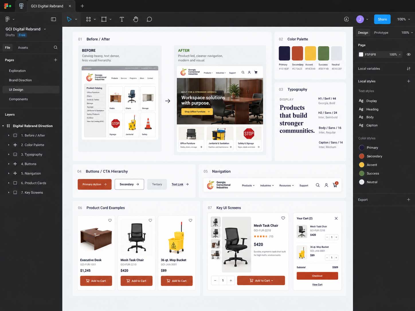
The visual direction preserved GCI’s established authority while introducing a cleaner digital hierarchy, more consistent product imagery, stronger calls to action, and reusable interface patterns. I carried that rebrand into the website itself, translating the approved visual and UX direction into responsive Magento pages and front-end behaviors.
- Brand application: More consistent logo, color, typography, imagery, and promotional treatment across the experience.
- Visual clarity: Stronger contrast between navigation, product content, specifications, and purchase actions.
- Product context: A shift toward imagery and layouts that help buyers understand products in use.
- Scalability: Patterns designed to support new categories and product information over time.
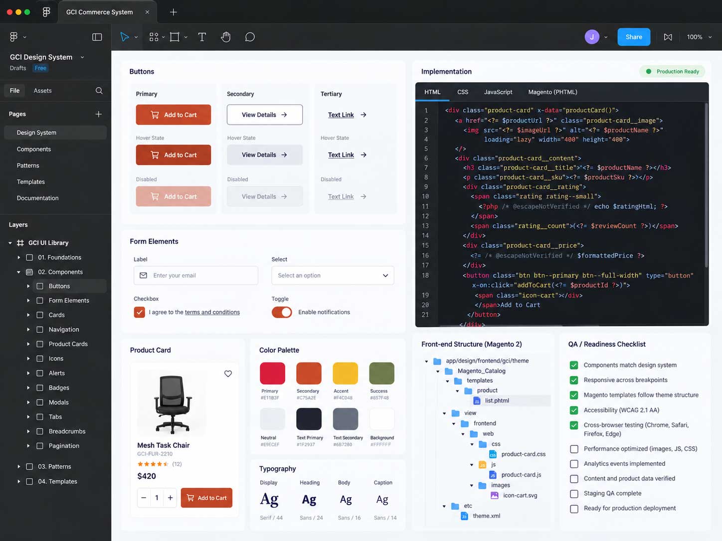
- Front-end delivery: HTML, CSS, and JavaScript were used within Magento to translate the design system into responsive, production-ready product and commerce experiences.
Experience design
Reducing friction from discovery through purchasing.
The experience was organized around the questions buyers ask: What is available? Is this right for my need? What information is required? How do I purchase, request a quote, or order through an institutional process? Research, heatmap analysis, competitive review, iterative wireframing, and testing helped determine how those questions should surface in the interface.
Organizing the catalog around recognizable buyer needs.
Clearer category relationships, product labels, and discovery paths helped reduce the burden of navigating a large, specialized catalog.
- More understandable product groupings
- Consistent category naming and navigation cues
- Filtering and search patterns designed around relevant product attributes

Shared structure with category-specific flexibility.
Reusable category templates supported consistent browsing while allowing furniture, chemicals, cleaning products, and signs to surface the attributes most relevant to each category.

Turning product pages into decision-support tools.
Product imagery, specifications, variations, downloads, fulfillment details, institutional guidance, and related actions were brought together in a more predictable hierarchy.

Supporting more than a standard retail checkout.
The experience accounted for the ways institutional and public buyers may need to move forward, including direct purchase, quote requests, purchase orders, invoicing, tax-exempt needs, or product customization.
- Clear next steps and progress guidance
- Contextual support for specialized purchasing paths
- Accessible form labels, errors, and confirmation states
Design system and accessibility
Reusable patterns connected the experience from navigation to checkout.
The system emphasized consistency, accessibility, and implementation clarity across navigation, product cards, filters, accordions, forms, calls to action, and responsive states. Because I also worked on the front-end build, component decisions were made with Magento content structures, HTML semantics, CSS behavior, JavaScript interactions, and long-term maintainability in mind.
Accessible
Contrast, focus states, keyboard use, labels, errors, and readable hierarchy were treated as part of the design.
Reusable
Components could support multiple categories and workflows without creating separate visual systems.
Responsive
Layouts and controls were designed to remain usable across desktop, tablet, and mobile contexts.
Build-aware
I translated reusable patterns into Magento using HTML, CSS, and JavaScript, connecting design intent to responsive behavior, content variability, accessibility, and production QA.
End result · qualitative impact
A clearer foundation for a complex commerce ecosystem.
The redesigned direction connected GCI’s digital brand, diverse product catalog, institutional workflows, responsive UI, and Magento front-end implementation into a more coherent product experience. Stakeholder interviews, competitive analysis, heatmap review, iterative wireframing, and testing informed the decisions shown throughout the system, while HTML, CSS, and JavaScript carried those decisions into the production website. Where quantitative metrics are not presented, the case study focuses on the validated structural and usability improvements visible in the product experience itself.

Clearer discovery
Product groupings and interface patterns gave buyers more understandable paths into a broad catalog.
More useful product content
Repeatable page structures helped surface the information needed to evaluate different product types.
Greater scalability
A shared design-and-development system created a stronger foundation for new products, categories, content, purchasing needs, and future Magento updates.
Related discipline