Modular Brand System
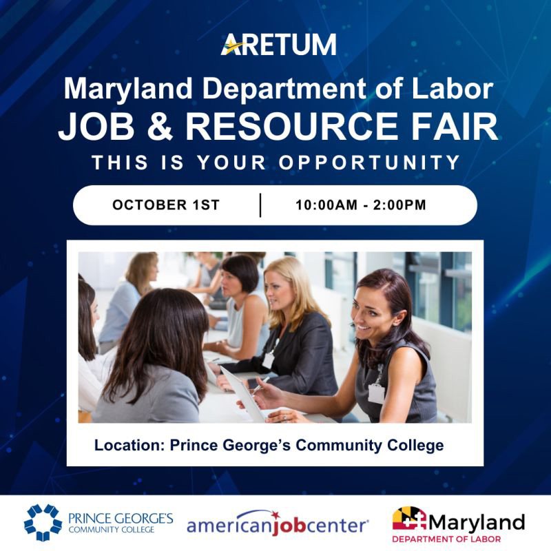
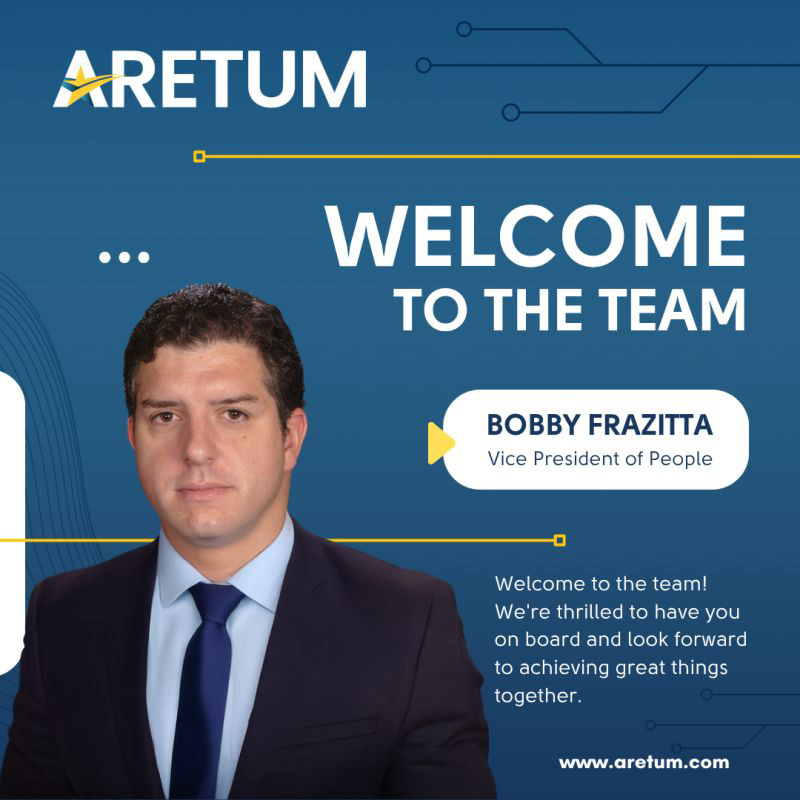
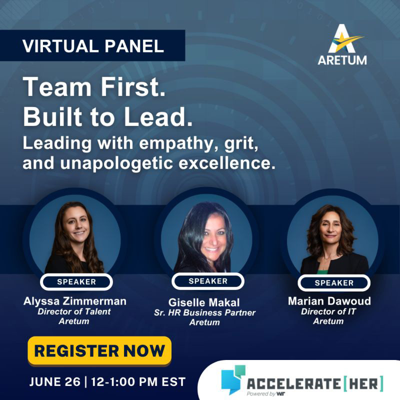
Reusable layout structures helped Aretum maintain consistency across onboarding, event, recruiting, and announcement graphics.
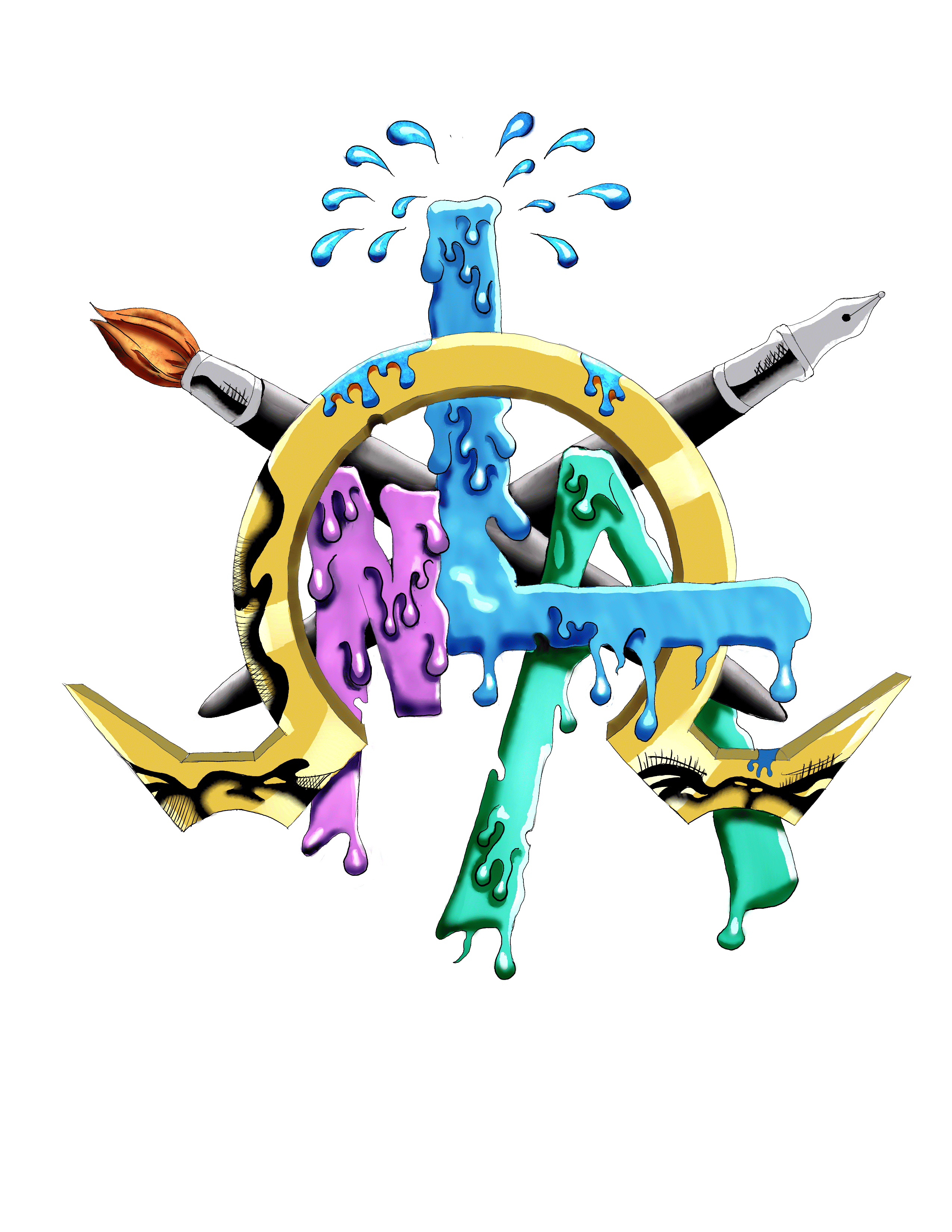
For Aretum’s social, recruiting, onboarding, and event communications, I designed a flexible set of branded graphics built for fast recognition across LinkedIn, email, web, and print. The goal was to create a polished visual system that could support recurring announcements while keeping each message clear, professional, and campaign-ready.
My design approach focused on brand consistency, modular layout structure, and mobile-first readability. Each graphic was built around a clear communication hierarchy: a strong headline, immediate context, supporting details, and a visible call to action. This helped ensure the designs could be understood quickly in fast-moving social feeds while still maintaining a professional government contracting and B2B brand presence.
The final graphics use Aretum’s brand colors, structured information blocks, bold typography, speaker or employee imagery, and technology-inspired visual elements to create a cohesive system across multiple content types. The result is a scalable set of visual assets that supports internal communication, recruiting visibility, event promotion, and brand awareness with a consistent design language.
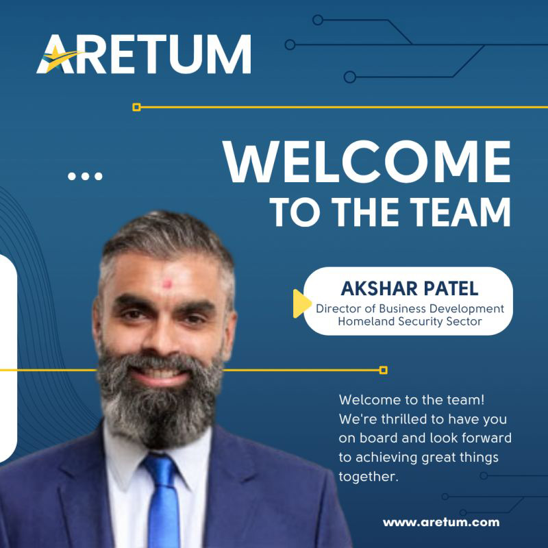
Reusable layout structures helped Aretum maintain consistency across onboarding, event, recruiting, and announcement graphics.
Large headlines, structured detail blocks, and clear calls to action made each graphic easier to scan in social feeds.
Brand colors, technology motifs, and polished composition helped the assets feel professional, energetic, and ready for multi-channel use.
These graphics were designed for multiple audiences, including external candidates, event attendees, industry partners, internal employees, and prospective clients. Because the communication needs varied across recruiting, onboarding, and event promotion, the designs needed to be flexible enough to support different messages while still feeling connected to the same brand system.
The primary communication goal was to make each message immediately understandable. Whether the graphic introduced a new team member, promoted a job and resource fair, or highlighted a virtual panel, the layout had to answer the essential questions quickly: who is involved, what is happening, when it takes place, where to engage, and why the audience should care.
The visual strategy centered on creating a recognizable Aretum campaign language. I used Aretum’s deep blues, bright accent colors, structured overlays, and technology-inspired background elements to reinforce the company’s positioning in cybersecurity, digital transformation, mission support, and government contracting.
The typography system was designed for quick impact. Large headline treatments created immediate entry points, while supporting details were placed in organized sections such as name bars, title areas, date and time blocks, location strips, and call-to-action zones. This design-first structure helped the content feel clear and intentional instead of crowded or purely functional.
I treated the graphics as a modular system rather than separate one-off designs. This approach made it easier to maintain consistency, speed up production, and adapt the creative direction for different campaign needs.
The final graphics gave Aretum a more consistent and scalable approach to day-to-day visual communication. Instead of treating each announcement as a separate design problem, the system provided a repeatable structure for recurring content while still allowing room for campaign-specific variation.
From a design standpoint, the value is in the balance between brand control and production speed. The assets improved visual consistency across hiring, onboarding, and event communications; made calls to action easier to identify; and supported faster turnaround for future communications through reusable layout patterns.