Visual + UX Design
Clear hierarchy, readable typography, deliberate CTA priority, brand consistency, and fast mobile scanning.

Case Study · Email Design & Development
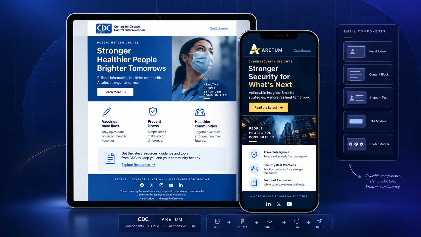
For CDC and Aretum, I translated communication goals into responsive email systems that balanced brand expression, content hierarchy, front-end constraints, accessibility, and production QA.
Role + approach
The work combined message hierarchy, reusable components, responsive behavior, and QA into one practical system.
Clear hierarchy, readable typography, deliberate CTA priority, brand consistency, and fast mobile scanning.
Email-safe HTML/CSS patterns, responsive stacking, fluid imagery, fallback-aware typography, and cross-client rendering considerations.
Reusable Figma modules and brand variants designed to support faster review, handoff, and future updates.
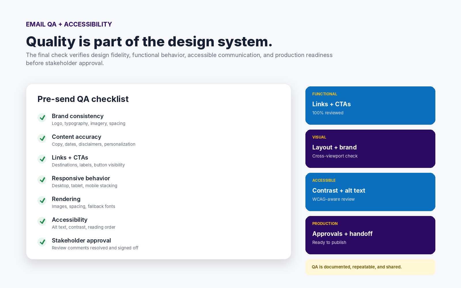
Content checks, link validation, responsive review, contrast, reading order, image alternatives, and final approval readiness.
The Challenge
My approach started with message priority: what needed immediate attention, what supported the primary action, and what could remain flexible as campaign content changed.
That structure became a modular system rather than a collection of one-off layouts, making the design easier to adapt, review, and carry into development.
Process
Each stage reduced uncertainty before the next: clarify the message, establish the system, build within email constraints, then validate the result.
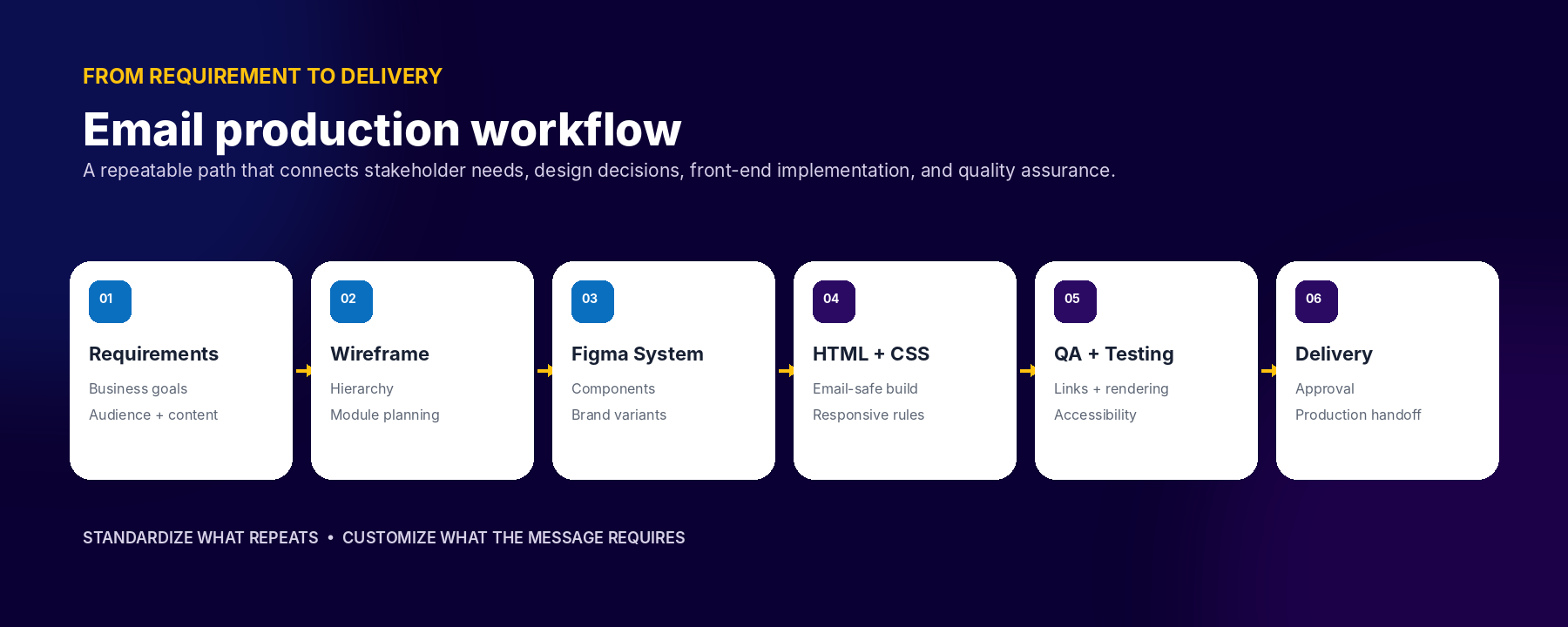
The first step was defining the objective, audience, content priority, mandatory messaging, brand constraints, and delivery requirements.
Once the direction was approved, I converted recurring patterns into reusable modules so revisions did not require redesigning the full communication.
Responsive behavior, accessibility, links, visual fidelity, and content accuracy were checked throughout the build rather than only at the end.
Figma System Setup
I applied the same component logic across two different brand systems, using shared structure while preserving the visual language, hierarchy, and communication goals of CDC and Aretum.
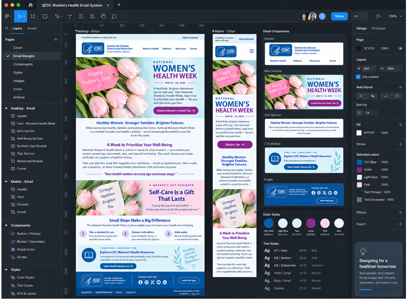
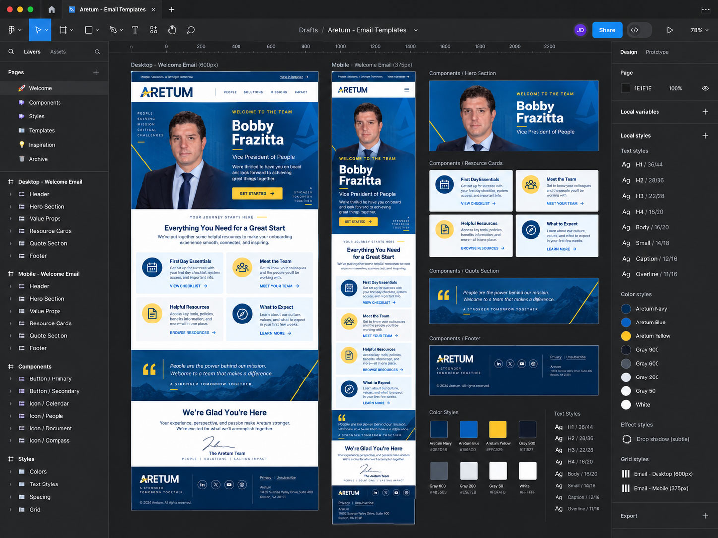
Consistent logo treatment, utility links, campaign identity, and spacing.
Headline hierarchy, supporting copy, imagery, and a clearly prioritized CTA.
Flexible content patterns designed to reflow predictably as available width changes.
Recurring organizational, compliance, contact, and preference-management content.
Design → Development
Development planning happened alongside design. The layout accounted for table-based structure, inline-safe styling, responsive media queries, fluid imagery, fallback fonts, accessible reading order, and the rendering limitations of major email clients.
I also considered how each campaign would support marketing and lead-generation goals after launch. Primary CTAs could be assigned campaign parameters and consistent naming conventions so click-through traffic could be attributed to the email and evaluated after the visitor reached the destination experience.
Using UTM-tagged links and Google Analytics 4, post-click behavior could be reviewed through landing-page engagement, CTA-driven sessions, key events, conversions, and lead activity. Metrics such as engagement rate and bounce rate provided additional context for understanding whether the message and destination experience were moving users toward the intended action.
Keeping development and measurement requirements visible early reduced the gap between the Figma system, the final email build, and the data needed to evaluate campaign effectiveness.
<table role="presentation"
width="100%" cellspacing="0"
cellpadding="0" border="0">
<tr>
<td align="center">
<table role="presentation"
width="600"
class="email-container"
cellspacing="0"
cellpadding="0"
border="0">
<tr>
<td class="brand-header">
<img
src="aretum-logo.png"
width="180"
alt="Aretum">
</td>
</tr>
<tr>
<td class="hero">
<p class="eyebrow">
PEOPLE · SOLUTIONS · IMPACT
</p>
<h1>
A stronger start begins here.
</h1>
<p>
Explore resources designed
to help you connect, learn,
and move forward.
</p>
<a
href="https://aretum.com/?utm_source=email&utm_medium=email&utm_campaign=welcome&utm_content=hero_cta"
class="cta">
Get Started →
</a>
</td>
</tr>
<tr>
<td class="content">
<h2>
Everything you need
for a great start
</h2>
<p>
Helpful resources,
team information,
and next steps in one
responsive experience.
</p>
</td>
</tr>
</table>
</td>
</tr>
</table>
<style>
@media only screen and (max-width:600px) {
.email-container {
width:100% !important;
}
.hero,
.content {
padding:24px !important;
}
.cta {
display:block !important;
text-align:center !important;
}
img {
max-width:100% !important;
height:auto !important;
}
}
</style>Representative Aretum campaign pattern showing responsive structure, branded content, and a UTM-tagged CTA for post-click campaign analysis.
Responsive Behavior
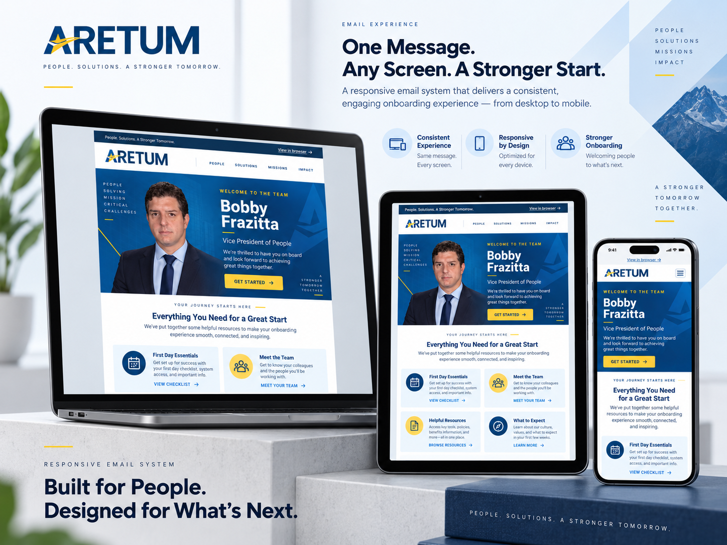
Across CDC and Aretum, hierarchy, CTA visibility, spacing, image behavior, and content order were evaluated across desktop, tablet, and mobile widths.
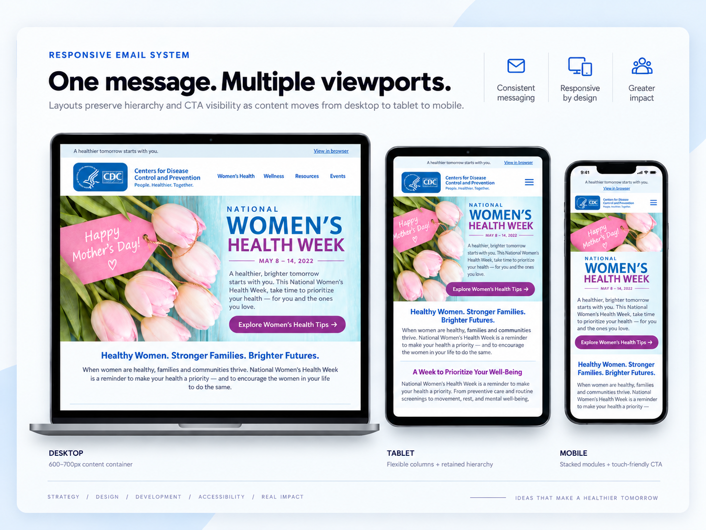
Health-awareness campaign using lifestyle imagery, long-form educational content, and a resource-driven CTA.
CDC · Selected Email Campaigns
For CDC communications, I focused on making important information easier to recognize, understand, and act on without weakening the authority of the brand.
A disciplined blue-and-white system, concise sections, clear hierarchy, repeatable content cards, and one obvious primary action.
Predictable content widths, responsive stacking, fluid imagery, and reusable sections supported a stable production structure.
Readable type, sufficient contrast, descriptive image alternatives, meaningful link language, and logical reading order guided the final review.
Reusable onboarding campaign adapted for a Director of Business Development while preserving the shared visual and component system.
Aretum · Selected Email Campaigns
For Aretum, I carried the brand’s visual language into email while keeping the authoring structure flexible enough to accommodate changing copy, imagery, CTAs, and stakeholder feedback.
Navy, blue, white, and yellow cues preserved recognition across the email and supporting campaign assets.
Hero, text, CTA, supporting content, and footer areas were separated into repeatable modules rather than fixed one-off layouts.
Consistent component structure and spacing rules created a clearer handoff for review, development, and future updates.
QA + Accessibility
Before handoff, I reviewed each communication against visual, functional, accessibility, and stakeholder requirements, then resolved issues before final approval.
Outcome
Client-specific performance metrics are not shown here, so the case study focuses on the operational value of the work: repeatability, clearer handoff, accessibility, consistency, and production readiness.
Modular patterns supported future communications without rebuilding the structure from scratch.
Clear components, spacing rules, and specifications reduced ambiguity during review and handoff.
Hierarchy, contrast, image alternatives, responsive behavior, and reading order were treated as core design requirements.
Design, development, QA, and stakeholder review were connected through one repeatable workflow.
Capabilities demonstrated